Posts

Showing posts with the label uah

2024 Satellite Temperature

Image
The December 2024 data from RSS was just made available, so I thought I'd put together some summary graphs for RSSv4 and UAHv6.1. The 2023-2024 warming spike was more pronounced in satellite data, which is intriguing. But RSS continues to show more warming than UAH.   Here are trends for the full dataset and the last 30 years: 1979 - 2024 Trends UAH: 0.153 ± 0.012°C/decade (2σ) RSS: 0.230 ± 0.012°C/decade (2σ) 1995-2024 Trends UAH: 0.162 ± 0.025°C/decade (2σ) RSS: 0.249 ± 0.024°C/decade (2σ) These trends seem pretty disparate from each other (RSS shows ~50% more rapid warming), and my uncertainty calculation doesn't account for all the sources of error in these datasets. Most importantly (as I share here ), difficulties with satellites beginning around 1998 were resolved in different ways between RSS and UAH. The decisions made by each explain a good portion of the disagreement between them (they can be seen between 1998 and 2004 below), and that is not factored in to the abov...

Is Global Warming Accelerating?

Image
There are a couple graphs graph circulating on X, one created by Javier Vinós and a modification of it by John Shewchuk, that are being used to suggest that global warming rates are decreasing. The origin of this graph comes from a Vinós  WUWT blogpost , and it superficially seems convincing. The relevant graph is labeled "Figure 2," and the caption claims, "Evolution of the warming rate for 15-year periods between 1979 and 2022 in °C/decade and its linear trend, from monthly UAH 6.0 satellite temperature data." Javier Vinós Thinks Global Warming Rates are Decreasing John Shewchuk thought it would be fun to remove the 15-year trends and plot just the slope of Vinós graph, along with the slope of a "CO2 increase rate." For our purposes here, we'll look just at the 15-year warming rate in this graph by examining how Vinós incorrectly constructed his version of his graph. Javier Vinós was kind enough to explain how he made his version of the graph: "...

Which Satellite Temperature Time Series is More Accurate?

Image
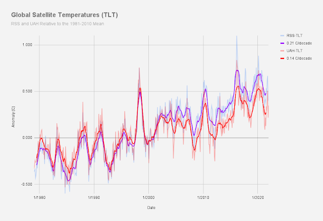
RSSv.4.0 and UAHv.6.0 Satellite Temperatures In a previous post , I summarized the most important reasons why the instrumental record is more accurate than satellites, and I showed that there is far more disparity between satellite datasets than there are among GMST datasets. In this post, I'd like to examine the satellite datasets to see if we can say to what extent some are more accurate than others. There are several satellite datasets, but three (RSS, UW and NOAA) strongly agree with each other, while the dataset from UAH is the outlier of the four. Keep in mind that in general all four of these use the same satellites So for the sake of simplicity, I'm going to simply compare RSS and UAH.  University of Alabama Huntsville (UAH) The UAH dataset is maintained by John Christy and Roy Spencer. For better or for worse, these scientists have strong disagreements with many of the conclusions of mainstream climate scientists. And at least in the opinion of many, perhaps not coinci...