Posts

Showing posts from April, 2023

New Berkeley Earth High Resolution Dataset

Image
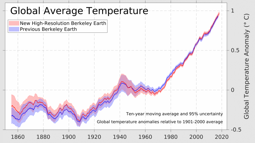
Berkeley Earth just released a new version of the GMST dataset, and it has 4 times the spatial resolution of the previous version of the data set at 0.25° x 0.25° (that's about 30 km at the equator). Visually, the difference is pretty striking when viewing temperature anomalies as a map. Here, for instance are 2022 global temperatures relative to a 1981-2010 mean. The time series has also slightly different from the previous version. Comparing the new high resolution dataset to the previous version, global temperatures in the base period appear to be slightly higher, lowering the amount of current warming above the 1980-1900 mean slightly. However, current warming rates appear to be slightly higher, at about 0.22 °C /decade instead of 0.21 °C /decade for the last 30 years. Here's how 30-year trends have changed across the dataset. To illustrate this, in a recent post , I calculated the warming above the 1850-1900 mean in the three datasets that go back to 1850, and the current

Has the "Hockey Stick" Been Disproven? Part 1 - Energy & Environment Politics

Image
After Michael Mann and his colleagues (MBH) published their first "hockey stick" paper in 1998[1] and its follow up in 1999[2], scientists had compelling evidence that recent warming, especially warming following 1950 or so, was unique in recent centuries. Geological evidence revealed that recent increases global and NH temperatures were detectable at rates beyond the natural variability observed over the last several hundred years. The resulting "hockey stick" graph was used in the IPCC's third assessment report, and the contrast between this graph and the previous schematic in the 1990 report was visually evident. The 1990 schematic was not a true reconstruction of global or even hemispheric temperatures; it was indistinguishable from a reconstruction Central England temperatures published in Lamb 1965. The 1990 graph was only a schematic with no temperature scale, and it ended in ~1950. The MBH "hockey stick" reconstruction was the first time the IP

Updated Calculation for ECS and TCR

Image
Every year I try to think of a way to update my simple calculations for ECS and TCR. My methods don't really change that much; they reflect updated data and become a little more complex. Make no mistake, they are simple calculations based on estimates of forcings, temperature and EEI using the energy balance equation. It doesn't compete with peer-reviewed studies by Sherwood[1] or the assessments of the IPCC. My intent with this is to show that the central estimates of the IPCC (and most climate models) are very consistent with empirical data.   The first step in the calculating ECS and TCR values is assessing the earth's energy imbalance and collecting the relevant forcing data. Earth's Energy Imbalance There are several estimates for EEI to choose from, but I think the most conservative approach is to use an average value for the full time frame between 2005 and 2019, when observations become much  more reliable. One study, Loeb et al 2021[2] estimated EEI to be 0.77

Debaters Behaving Badly, Part 4 - Inaccurately Comparing Datasets

Image
In previous posts in this series , I've tried summarize what I consider bad behavior among those debating climate change. So far I've discussing what I consider statistically unethical practices - using short-term trends, misusing scales, and using local instead of global data. Here I'd like to look how we make comparisons between types of data. In climate science, we need to deal with all sorts of different kinds of data. For global temperatures, I can think of at least 3 - proxies, the instrumental record (satellites, thermometers), and models (reanalysis, modeled projections, etc). It's perfectly fine to create graphs that include all of these kinds of data, but in doing so, we have to make sure that we are communicating honestly and making comparisons accurately. Proxy data has lower resolution and larger confidence intervals than the instrumental record, and modeled projections always depend in part on the assumed scenario, and confidence intervals for these projec

Debaters Behaving Badly, Part 3 - Confusing Local and Global Temperatures

Image
In my first two posts in this series , I described the bad behavior of cherry-picking short-term trends and choosing the wrong scale to hide the incline of global temperatures. Here I want to consider the trick of using local (or regional) temperatures in place of global temperatures. As best I can tell, there are at least two reasons why people might want to do this. Some people want to say that global warming is good, the world is starved of CO2, and we need to add more CO2 to the atmosphere. Unsurprisingly, two of the most prominent proponents of this tactic are former geologists for the fossil fuel industry. They want to show that societies thrive when global temperatures are warmer. Others using this tactic seem to want to say that global temperatures don't correlate with CO2. And what better way to make that point than to use local temperatures instead of global temperatures? Prepare for some snarkiness.  Using Local Temperatures to Say Global Warming Is Good Imagine you ha

Debaters Behaving Badly, Part 2 - Using Scales to Hide the Incline

Image
In  Part 1  of this series on debaters behaving badly, we saw how some debaters behave badly by misusing short-term trends to claim that global warming has paused, leading to the proliferation of what I consider faux pause claims on the internet and social media. Here in Part 2, I'd like to consider the next most popular tactic I see used frequently in climate debates - using dishonest scales to make false claims about global temperatures or the correlation between temperatures and carbon dioxide. Misusing Scale to "Hide the Incline" of Global Temperatures One of the largest repositories of bad debate behavior on the internet is on the Watts Up With That blog. Anthony Watts recently wrote a post complaining about accurate reporting of global temperature anomalies and decided to replace them with his substitute version , which you can find on a side bar of his blog whenever you visit. It looks like this: To do this, Watts replaced the baseline temperature value of the G

Debaters Behaving Badly, Part 1 - Cherry Picking Short-Term Trends

Image
I've witnessed many debates about climate change recently in which debaters behave badly. In fairness to at least some of these debaters, many don't realize they're behaving badly. They received information they trust on blogs and YouTube videos, and they use this information in a discussions with others. But these bad tactics are still bad behavior even if we don't know it. So I thought it would be helpful to write a series on the dishonest tactics I see used in debate contexts that reflect bad behavior (either by the debater or his/her source). I'll begin with a tactic I've seen quite commonly recently - cherry picking short-term trends.  This tactic is frequently used by debaters attempting to show that global warming has "paused" or that Arctic sea ice is no longer decreasing. In the interest of brevity, I'll focus on the claim that there has been a "pause" in global warming. As we'll see, this is a  faux pause claim (I'll be