In Part 1 of this series on debaters behaving badly, we saw how some debaters behave badly by misusing short-term trends to claim that global warming has paused, leading to the proliferation of what I consider faux pause claims on the internet and social media. Here in Part 2, I'd like to consider the next most popular tactic I see used frequently in climate debates - using dishonest scales to make false claims about global temperatures or the correlation between temperatures and carbon dioxide.
Misusing Scale to "Hide the Incline" of Global Temperatures
One of the largest repositories of bad debate behavior on the internet is on the Watts Up With That blog. Anthony Watts recently wrote a post complaining about accurate reporting of global temperature anomalies and decided to replace them with his substitute version, which you can find on a side bar of his blog whenever you visit. It looks like this:
To do this, Watts replaced the baseline temperature value of the GISTEMP dataset with 57.2 F (14 C) and then changed the temperature scale to go from -20 F to 120 F. The scale was chosen deliberately to be "representative of winter low temperature near the Arctic Circle and high summer temperature in many populated deserts, such as in the Middle East." He says that this scale presents global temperatures at "the scale of how humans experience Earth’s temperature where they live."
Really? I think not. It is not common human experience at all to experience winter nightime lows near the Arctic Circle AND summer daytime highs in the deserts of the Middle East. Few if anyone has ever experienced both of those areas during those seasonal extremes. More importantly, though, his chosen scale is not the scale of human experience of global temperatures. It's a scale representing the range of local, diurnal, and seasonal temperatures that people experience while global temperatures are unchanging. His scale is actually about 70x greater than the range of global temperatures that any human has ever experienced. Watts chose a scale of 140 F, but the scale of human experience for global temperatures is literally only about 2 F, so using 140 F allows him to "hide the incline" in global temperatures behind his choice of scale. As a general rule of thumb, scales should be chosen to reveal the most details of the data being plotted. The data can then be interpreted with text on the graph or in the document, but you don't choose scales to interpret data - you choose scales to clearly present the data. Allow me to provide three illustrations to show why his choice of scale is dishonest.
Comparison to Glacial Cycles
Here is a plot of global temperatures for the last 800,000 years from
Carolyn Snyder's 2016 study. The difference between the highs and lows in this graph is the difference between glacial maximums and thermal maximums. Since the data I have is in C, not F, I set the scale of the y-axis to approximately equal the scale chosen by Watts (I used -30 C to 50 C instead of -20 F to 120 F). Note how the differences between the glacial maximums and thermal maximums are much harder to notice. Even though the Earth's climate system shown at the highs and lows of this graph are far larger than human civilization has ever seen, the differences between them seem small. Most of the scale is completely unnecessary. It serves only one purpose, hiding changes in temperature.
.png)
In common human experience, humanity can survive and thrive with large swings diurnal temperatures, seasonal cold temperatures in the Arctic and seasonal hot temperatures in the Middle East. But an 8 F decrease in global temperatures is the difference between our current interglacial and Canada covered in hundreds of feet of ice. The globe has literally never seen a GMST of -20 F. Even if the earth didn't have an atmosphere, global temperatures would average about -1 F. According to Christopher
Scotese's estimates, the warmest temperatures of the last 570 million years were during the end-Permian extinction - an event that killed off almost all life at about 91 F. He estimates the coldest temperatures were during Ordovician glaciation at about 48 F. There is no rational basis for plotting global temperatures on Watts' scale.
Comparison to Human Body Temperature
Watts' scale depends on comparing apples and oranges; he chose his scale to reflect what the data isn't measuring. For an illustration of this, imagine making a chart of a patient's temperature and how it has been changing every hour for the last two days. If you choose as your scale the range of human experience instead of the measured data, the range you could choose is pretty wide. Perhaps you could choose -20 F because some restaurant freezers are that cold and 212 F because you can stick your finger in a pot of boiling water. Because the scale has nothing to do with the data you're measuring, it's arbitrary. So you could make this graph to show to your doctor.
The doctor would have a hard time knowing to what extent his/her patient's temperature is increasing. But if you plot the same data with a scale chosen on the basis of the measured data, it looks like this.
The first scale is set by survivable environmental conditions - people can survive going in a restaurant freezer or putting a finger in boiling water, but that's not what the data is measuring, so the scale is arbitrary. The data is measuring changes in body temperature. Likewise, Watts' scale is set by survivable local, diurnal, and seasonal environmental conditions - people can survive really cold nights during Arctic winters and really hot daytime highs in the deserts during Middle Eastern summers. But that's not what the data is measuring, so the scale is arbitrary. The data is measuring global mean surface temperature.
Watts objects to scales based on the measured data because it looks alarming to him. However, the data is either alarming or not regardless of the scale, and you can only see the data well enough to see if the data is alarming if you have a scale based on the measured data. In the case of a patient's temperature above, this patient has a very serious health condition that is getting rapidly worse, but the "human experience" scale obscures this. What Anthony Watts (and others using this tactic) are doing is deliberately using scale to "hide the incline" of global temperatures.
Comparison to Waves, Tides and Relative Sea Level
When we have a need for accurate graphs of data, the usefulness graph in part depends on scales chosen based on the data being graphed, and the appropriate scale on the y axis often depends on the scale of the x axis (in this case, time). If you go a beach and watch the waves coming up on shore, you'll find waves coming in with varying amounts of energy, such that some waves move farther up the shoreline than other waves. On a scale of minutes to hours, this is the way we experience waves at the beach. However, on longer time scales, shorelines experience high tides every 12 hours or so. The movement of the tides is almost imperceptible to us unless you watch carefully for 6 hours or so, but there are many reasons why it's important for us to keep track of the movement of the tides. Tide charts do not need the scale of wave experience to be useful. In fact, tide charts are more useful if you choose a scale that allows you to see tide changes with greater clarity. Likewise, sea levels in most coastal locations are changing, due both to AGW and vertical land movement (VLM). While our experience of coastlines is dominated by wave activity and tides, that doesn't mean that sea level rise isn't real and doesn't deserve to be graphed using a scale that allows us to clearly see how sea levels at any location are changing. The scale of the y-axis needs to be determined by the range of data that is being plotted, not the scale that is perceived to support an ideological agenda.
Misusing Scale to Say Little Correlation between CO2 and Temperature
Sometimes you can find people who will take this bad behavior one step further. They go beyond choosing a scale for temperature to "hide the incline;" they then choose a scale for CO2 to to create the impression of little to no correlation between CO2 and global temperatures. Here's a graph attributed to c3headlines.
The
CO2 Coalition took this another step further by switching out global temperatures for Central England temperatures and using dishonest scales to create the impression little correlation between the two.
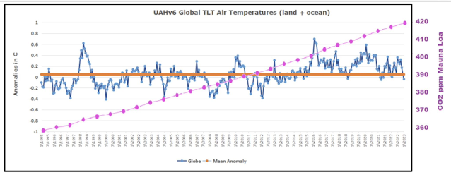
Here's another example using UAHv6 data.
The authors of these graphs are using the same WUWT trick above with the added twist of choosing a scale for CO2 to give the impression that the two are not correlated. But of course you can take any two variables and create the impression that they are not correlated in this way, and you don't even need two variables. You can take the the same data and plot it twice on the same graph with two different scales to give the impression that the data doesn't correlate with itself. For instance, here's a graph using the WUWT trick to create the impression that CO2 doesn't correlate with Carbon Dioxide.
.png) |
Choosing a Dishonest Scale Can Create the
False Impression of No Correlation of CO2 with CO2 |
If you want to see if CO2 and GMST correlate, you can just plot CO2 on the x-axis and GMST on the y-axis and calculate a logarithmic trend. The r^2 value will tell you how well the two are correlated. The r^2 for this relationship is 0.88. In other words, CO2 and GMST are very well correlated across the instrumental record, and the correlation is about what you'd expect if CO2 is driving global warming with natural variability operating on the a long-term warming trend.
.png) |
| The Correlation of CO2 with GMST Can be Quantified |
Of course it's true that not everyone sharing graphs that use this trick realize that they are being dishonest. And it's also certainly true that this correlation does not prove causation. But using dishonest scales also doesn't prove lack of correlation. The evidence for correlation is clear from the data, but the denial of causation is easier to support if you create the false impression that CO2 and GMST are not correlated, so this trick has become an extremely common way to use graphs in such a way to create false impressions of the data.

.png)

.png)


.png)
.png)


Comments
Post a Comment