Was There a "Mike's Nature Trick" to "Hide the Decline?" Part 1 - Misreading CRU Emails
In November 2009, someone likely stole[1] and publicly released over 1,000 emails from Climate Research Unit (CRU) at the University of East Anglia. Following this, people combed through all these emails looking for evidence of frauds and coverups on the part of climate scientists. They found very little damaging information, but not everything they found was was good. There were, as best I can tell, four categories of content that were discovered:Here I plan to tackle the "hide the decline" email, since so many contrarians think there's evidence here of some sort of fraud and coverup. Most of these accusations depend on misquoting and then misunderstanding the email. It's actually taken on a life of its own, independent from the actual text and context of the email. What I would like to do is examine the email in the context of the graph that it references. We'll examine whether the email describes anything unethical that was done, and if so, whether this affects the integrity of the graph in any way.
The email was written on Tue, 16 Nov 1999 in a correspondence between Phil Jones of CRU and the authors of two proxy reconstruction papers. The primary recipients were Michael Mann, Ray Bradley and Malcolm Hughes with a CC to Keith Briffa and Timothy Osborn. In this email, Jones writes,

The description of this cover art was written as, "Front cover: Northern Hemisphere temperatures were reconstructed for the past 1000 years (up to 1999) using palaeoclimatic records (tree rings, corals, ice cores, lake sediments, etc.), along with historical and long instrumental records." There is also an explanation for this graph on page 4. Here's the relevant portion of the explanation.

Jones' adaptation of this graph used his own reconstruction[9] through 1980 with Mann's through 1980 and Briffa's through 1960. He then added the appropriate instrumental record to each of those time series. Because each time series shows different things, his email describes precisely what he did to each time series.So the WMO statement graph is very similar to that produced by Briffa in 1999, with the big difference here is that the appropriate instrumental record is seamlessly added to proxy record so you can't tell by looking at the graph where the proxy evidence ends and where the instrumental record begins. We know from the image description that there was a transition to the instrumental record, but we don't know when that was. The transition from proxy to instrumental is seamless, with no indication in the graph or its explanation when the change in data type took place in each time series.
- The normal kinds of communication you'd expect to find in correspondence between scientists
- Words and phrases that were twisted out of context and redefined to support an imagined conspiracy that had been imposed on the emails.
- Evidence of mean-spirited attacks on contrarian scientists and heavy-handed tactics intended to punish journals that published contrarian studies.
- A single email describing the process of creating a graph for a WMO statement that used the phrase "hide the decline."
The Email
I’ve just completed Mike’s Nature trick of adding in the real temps to each series for the last 20 years (ie from 1981 onwards) and from 1961 for Keith’s to hide the decline. Mike’s series got the annual land and marine values while the other two got April–Sept for NH land N of 20N. The latter two are real for 1999, while the estimate for 1999 for NH combined is +0.44C wrt 61–90. The Global estimate for 1999 with data through Oct is +0.35C cf. 0.57 for 1998.Jones is describing the process he used to construct a graph that was placed on the front cover of a WMO statement[2] on global climate during 1999. It's this graph here.
The description of this cover art was written as, "Front cover: Northern Hemisphere temperatures were reconstructed for the past 1000 years (up to 1999) using palaeoclimatic records (tree rings, corals, ice cores, lake sediments, etc.), along with historical and long instrumental records." There is also an explanation for this graph on page 4. Here's the relevant portion of the explanation.
"Our knowledge of pre-20th century temperature variations in the Northern Hemisphere has increased dramatically in recent years. The availability of natural archives of past temperature such as tree rings, banded corals, ice cores and lake sediments, in addition to historical and long instrumental records, has enabled NH temperature variations to be reconstructed for the last 1000 years at an annual resolution. It is not yet possible to do the same for the Southern Hemisphere due to the lack of adequate palaeoclimatic records. Despite their different emphases on annual or extended summer seasonal temperatures and their different geographical biases, all the reconstructions (shown on the front cover as 50-year smoothed differences from the 1961–1990 normal) indicate that against the background of the millennium as a whole, the 20th century was unusually warm. Uncertainties increase earlier in the millennium due to the sparser and imperfect nature of proxy data (95% confidence errors of ± 0.3°C for 1000–1500, reducing to ± 0.1°C by the early 19th century on this 50-year time scale)."
Jones appears to have adapted the WMO graph from Briffa 1999[3]. Briffa's graph shows the Apr-Sep land instrumental record from 1871 to 1997, NH tree-ring density proxies for temperature from 1550 to 1960 from Briffa's previous work[4][5][6] and proxies from 1000 to 1980 from Mann's studies[7][8].
Jones' adaptation of this graph used his own reconstruction[9] through 1980 with Mann's through 1980 and Briffa's through 1960. He then added the appropriate instrumental record to each of those time series. Because each time series shows different things, his email describes precisely what he did to each time series.
- To Jones' time series, he added land Apr to Sep NH temperatures following 1980.
- To Mann's time series, he added land and ocean annual NH temperatures following 1980.
- To Briffa's time series, he added land Apr to Sep NH temperatures following 1960.
Jones described that his reasoning for choosing 1961 for Briffa's time series was to "hide the decline." He's referring to the decline in tree ring density following 1960 that affected samples from boreal forests. This was to address what was (and is) a well-known problem called the "divergence problem," and there were multiple papers describing this problem in the peer-reviewed literature, including papers by Briffa. I'll probably share more about this in a future post, but for now, this is a problem affecting select trees, mostly from boreal forests, where tree ring densities fail to match instrumental temperatures following 1960 or so. The evidence we have shows that it's a recent problem, possibly caused by selection bias introduced by sampling forests with a higher proportion of younger trees.

The graph quite clearly shows a global reconstruction back to a.d. 1400 with reconstructed temperatures and instrumental temperatures ("actual data") delineated separately, but both included together on the same graph for easy comparison. That was "Mike's Nature trick." It was simply "adding in the real temps" to the proxy data, and in MBH98 it's clearly stated that's what he was doing. The same is true for MBH99, which reconstructed Northern Hemisphere temperatures from a.d. 1000. Here's the graph from MBH99, published in GRL.
This is the data that was used for Mann's time series in the WMO statement and the IPCC Third Assessment Report (TAR). Notice that the reconstruction is clearly stated to cover a.d. 1000 to 1980 while the instrumental record from 1902 to 1998. And in case there is any doubt, here's the graph from TAR.
 Each of the above reconstructions can be said to have used "Mike's Nature trick," but none of them could reasonably be accused of doing anything unethical for showing both the proxy reconstruction and the instrumental data on the same graph. There is absolutely nothing wrong with this "trick" as it was used by MBH98, MBH99 and the IPCC's TAR. Whatever we end up thinking about what Jones did to "hide the decline," that problem does not extend to the hockey stick in general but to its presentation in the WMO statement.

As you can see, while Mann's and Jones' series track with the WMO graph through 1980, Briffa's series plummets after 1960 because of the quality of the tree ring data in Briffa's paper. Some have suggested that this means that Jones (and the others included in the email discussion) were involved in "hiding" this discrepancy between the instrumental record and the proxy data. In the graph above, it's even said that this is what the reconstruction would look like if "Mike's trick is not used" - a claim that is based on an explicitly dishonest reading of the email. However, the fact that unreliable proxy data wasn't included in the published WMO graph doesn't mean that anything was hidden. The graph claims and is intended to show NH temperatures from a.d. 1000 to 1999; it's not specifically a graph of proxy data. It turns out that 1) each of these time series was already published in the peer reviewed literature with the instrumental data distinct from the proxy reconstruction and 2) the divergence between tree ring proxies and instrumental data was already in the peer-reviewed literature when the WMO statement was published.
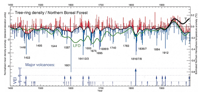
Scientists would also have been aware of the divergence problem in other treatments of the subject going back at least to 1995. In this paper from 1998,[6] Briffa also goes into a considerable amount of detail describing the problem. This graph shows the discrepancy between the Apr - Sep mean temperatures in the instrumental record with proxy data.
 If Jones was intending to hide the divergence between tree ring proxies and the instrumental record, he did a pretty poor job, because that was already known and discussed in the scientific literature for about 5 years. Jones deleting Briffa's tree ring proxy data following 1960 could not have hidden the divergence problem. There was nothing hidden from the public and certainly not from scientists familiar with the divergence problem; it was already published in the scientific literature.
[1] There’s some dispute over whether the stolen emails were due to a hack or a leak. While I don’t know of any conclusive evidence, the servers for the RealClimate blog were also hacked, and the emails were uploaded to their website. This would suggest that it wasn’t a leak from someone at CRU, but rather a hacking job.
[2] WMO, WMO Statement on the Status of the Global Climate in 1999. WMO-No. 913. https://library.wmo.int/doc_num.php?explnum_id=3460
[3] Briffa, K. R. (1999). CLIMATE WARMING: Seeing the Wood from the Trees. Science, 284(5416), 926–927. doi:10.1126/science.284.5416.926
10.1126/science.284.5416.926
[4] Briffa, K., Schweingruber, F., Jones, P. et al. Reduced sensitivity of recent tree-growth to temperature at high northern latitudes. Nature 391, 678–682 (1998). https://doi.org/10.1038/35596
[5] Briffa, K. R., Jones, P. D., Schweingruber, F. H., & Osborn, T. J. (1998). Influence of volcanic eruptions on Northern Hemisphere summer temperature over the past 600 years. Nature, 393(6684), 450-455. https://doi.org/10.1038/30943
[6] Briffa, K. R., Schweingruber, F. H., Jones, P. D., Osborn, T. J., Harris, I. C., Shiyatov, S. G., … Grudd, H. (1998). Trees tell of past climates: but are they speaking less clearly today? Philosophical Transactions of the Royal Society B: Biological Sciences, 353(1365), 65–73. doi:10.1098/rstb.1998.0191
[7] Mann, M., Bradley, R. & Hughes, M. Global-scale temperature patterns and climate forcing over the past six centuries. Nature 392, 779–787 (1998). https://doi.org/10.1038/33859 and
[8] Mann, M. E., Bradley, R. S., & Hughes, M. K. (1999). Northern hemisphere temperatures during the past millennium: Inferences, uncertainties, and limitations. Geophysical Research Letters, 26(6), 759–762. doi:10.1029/1999gl900070
[9] Jones, P. D., Briffa, K. R., Barnett, T. P., & Tett, S. F. B. (1998). High-resolution palaeoclimatic records for the last millennium: interpretation, integration and comparison with General Circulation Model control-run temperatures. The Holocene, 8(4), 455–471. doi:10.1191/095968398667194956
[10] Keith R Briffa, Annual climate variability in the Holocene: interpreting the message of ancient trees, Quaternary Science Reviews, Volume 19, Issues 1–5, 2000, pp. 87-105,
"Mike's Nature Trick"
In public discourse, there has been a great deal of discussion of this email that is based on a misquote of its contents. Some critics have shortened the quote to "Let's use Mike's trick to hide the decline." But that conflates "Mike's Nature trick" with "hide the decline." It also removes the word "Nature," which was the name of the journal Mann published his hockey stick reconstruction in 1998. As we'll see, it's important to keep these phrases separate. Let's deal first with "Mike's Nature trick."
Michael Mann published two papers with Bradley and Hughes (the other two recipients of the email) in 1998 and 1999. We'll refer to these as MBH98[8] and MBH99.[9] MBH98 was published in Nature, so the "trick" must have come from the 1998 paper. Here's the graph from that paper.
The graph quite clearly shows a global reconstruction back to a.d. 1400 with reconstructed temperatures and instrumental temperatures ("actual data") delineated separately, but both included together on the same graph for easy comparison. That was "Mike's Nature trick." It was simply "adding in the real temps" to the proxy data, and in MBH98 it's clearly stated that's what he was doing. The same is true for MBH99, which reconstructed Northern Hemisphere temperatures from a.d. 1000. Here's the graph from MBH99, published in GRL.
This is the data that was used for Mann's time series in the WMO statement and the IPCC Third Assessment Report (TAR). Notice that the reconstruction is clearly stated to cover a.d. 1000 to 1980 while the instrumental record from 1902 to 1998. And in case there is any doubt, here's the graph from TAR.

"Hide the Decline"
As I've already hinted at above, Jones did not use "Mike's Nature trick" to "hide the decline." Mike's Nature trick was simply to add both the proxy and instrumental data together on the same graph. What Jones did to "hide the decline" was to choose 1961 for Briffa's time series instead of 1981. He writes, "I’ve just completed Mike’s Nature trick of adding in the real temps to each series for the last 20 years (ie from 1981 onwards) and from 1961 for Keith’s to hide the decline." The "decline" that Jones wanted to hide was the decline in tree ring density following 1960, and that was a problem with Briffa's time series, not the other two. The proxy reconstructions of the other two time series were not limited to tree ring data, so they continued to 1980. What Jones was "hiding" was the unreliable data in Briffa's tree ring-only proxy reconstruction. In one popular criticism of the WMO graph, the proxy data from Briffa following 1961 is shown without the instrumental record.
As you can see, while Mann's and Jones' series track with the WMO graph through 1980, Briffa's series plummets after 1960 because of the quality of the tree ring data in Briffa's paper. Some have suggested that this means that Jones (and the others included in the email discussion) were involved in "hiding" this discrepancy between the instrumental record and the proxy data. In the graph above, it's even said that this is what the reconstruction would look like if "Mike's trick is not used" - a claim that is based on an explicitly dishonest reading of the email. However, the fact that unreliable proxy data wasn't included in the published WMO graph doesn't mean that anything was hidden. The graph claims and is intended to show NH temperatures from a.d. 1000 to 1999; it's not specifically a graph of proxy data. It turns out that 1) each of these time series was already published in the peer reviewed literature with the instrumental data distinct from the proxy reconstruction and 2) the divergence between tree ring proxies and instrumental data was already in the peer-reviewed literature when the WMO statement was published.
The following comes from Briffa 2000,[10] You can clearly see the divergence between the instrumental record (thick black line) and tree ring proxies following 1960.
Was Jones Ethical in the WMO Graph?
This particular email has taken on a life of its own with unending charges of fraud, data manipulation, and hiding data that contradicts global warming. I consider these kind of ridiculous. But the fact remains that Jones did say he wanted to "hide" something, and hiding is generally not consistent with transparency. I think we have evidence here of a lack of transparency, at least on the part of Jones. All Jones had to do is to indicate on the graph and/or explanation at what points of time the proxy and instrumental data were merged - 1980 for Jones and Mann and 1960 for Briffa. He could easily have changed the time series to a dotted line at 1960 or 1980 and indicated the transition to the instrumental record, and if he had, none of the critics would have anything legitimate to complain about. I think we all believe it's important for scientists both to do competent work and be truthful about it, but I think equally important is transparency. It's transparency that builds trust, and it's the lack of transparency that creates suspicion - that suspicion could have been avoided if Jones had disclosed exactly what he had done.That said, the graph itself is essentially correct. It presents three time series that show the best evidence at the time for NH temperatures from a.d. 1000 to 1999. As I see it the authors did good, competent work. Even showing three time series instead of just one give readers a sense of the uncertainties in the various proxy reconstructions. If the graph simply noted where the instrumental record begins in each time series, I would have nothing to complain about.
So my conclusion is this. Jones erred in not disclosing when the transitions to the instrumental record began. The failure was a failure of transparency - he didn't fully disclose what his readers should have been told. However, the graph itself is a truthful presentation of NH temperatures. Someone reading that graph and taking it at face value would have an accurate understanding of the available evidence of NH temperature variability over the previous millennium. Now 22 years later, we have far more extensive proxies and a better understanding of global temperatures, but this graph is valid for the evidence its authors had available to them at the time.
References:
[2] WMO, WMO Statement on the Status of the Global Climate in 1999. WMO-No. 913. https://library.wmo.int/doc_num.php?explnum_id=3460
[3] Briffa, K. R. (1999). CLIMATE WARMING: Seeing the Wood from the Trees. Science, 284(5416), 926–927. doi:10.1126/science.284.5416.926
10.1126/science.284.5416.926
[4] Briffa, K., Schweingruber, F., Jones, P. et al. Reduced sensitivity of recent tree-growth to temperature at high northern latitudes. Nature 391, 678–682 (1998). https://doi.org/10.1038/35596
[5] Briffa, K. R., Jones, P. D., Schweingruber, F. H., & Osborn, T. J. (1998). Influence of volcanic eruptions on Northern Hemisphere summer temperature over the past 600 years. Nature, 393(6684), 450-455. https://doi.org/10.1038/30943
[6] Briffa, K. R., Schweingruber, F. H., Jones, P. D., Osborn, T. J., Harris, I. C., Shiyatov, S. G., … Grudd, H. (1998). Trees tell of past climates: but are they speaking less clearly today? Philosophical Transactions of the Royal Society B: Biological Sciences, 353(1365), 65–73. doi:10.1098/rstb.1998.0191
[7] Mann, M., Bradley, R. & Hughes, M. Global-scale temperature patterns and climate forcing over the past six centuries. Nature 392, 779–787 (1998). https://doi.org/10.1038/33859 and
[8] Mann, M. E., Bradley, R. S., & Hughes, M. K. (1999). Northern hemisphere temperatures during the past millennium: Inferences, uncertainties, and limitations. Geophysical Research Letters, 26(6), 759–762. doi:10.1029/1999gl900070
[9] Jones, P. D., Briffa, K. R., Barnett, T. P., & Tett, S. F. B. (1998). High-resolution palaeoclimatic records for the last millennium: interpretation, integration and comparison with General Circulation Model control-run temperatures. The Holocene, 8(4), 455–471. doi:10.1191/095968398667194956
[10] Keith R Briffa, Annual climate variability in the Holocene: interpreting the message of ancient trees, Quaternary Science Reviews, Volume 19, Issues 1–5, 2000, pp. 87-105,


"We know from the image description that there was a transition to the instrumental record, but we don't know when that was."
ReplyDeleteThe image description only refers to the long temperature and precipitation records that were part of the Mann et al. proxy data set. These records end in 1980. I don't see any mention of a transition to the instrumental record.
The image description refers to "long instrumental records." These were prepared for each time series, as described in the email, and they began in 1980 for Jones and Mann; it began in 1960 for Briffa. The only thing lacking from the description is when this transition occurs for each time series.
DeleteThe "long instrumental records" were part of the Mann et al. 1998 proxy network. From the paper:
Delete"We use a multiproxy network consisting of widely distributed high-quality annual-resolution proxy climate indicators, individually collected and formerly analysed by many palaeoclimate researchers (details and references are available: see Supplementary Information). The network includes (Fig. 1a) the collection of annual-resolution dendroclimatic, ice core, ice melt, and long historical records used by Bradley and Jones combined with other coral, ice core, dendroclimatic, and long instrumental records. The long instrumental records have been formed into annual mean anomalies relative to the 1902–80 reference period, and gridded onto a 5° x 5° grid (yielding 11 temperature grid-point series and 12 precipitation grid-point series dating back to 1820 or earlier) similar to that shown in Fig. 1b."
Yep. They obviously declared that they used long instrumental records, so there must have been a transition, but they just don't say when that transition was.
DeleteLike other Mann et al. proxies, the "long instrumental records" end in 1980.
DeleteThe WMO text does not imply a transition to the long instrumental records, or any other class of proxies mentioned in the same sentence.
The instrumental record went to 1998. It says so right in the email; if you doubt me, just look at the time series on the WMO chart. The text absolutely requires a transition from proxy to instrumental records.
DeleteYes, it says so in the hide-the-decline email. The WMO report on the other hand does not mention the splicing.
DeleteThe email is clear about what was done. The WMO report shows what it correctly claims to be a mixture of instrumental and proxy evidence. Since instrumental data didn't go much before 1900, there must have been a transition from proxy to instrumental data in order for the time series to cover the years it covered. What was missing was when that transition occurred.
DeleteI understand your interpretation of the WMO text. But it's a fact that the "long instrumental records" referred to in Mann et al. 1998 are temperature and precipitation records ending in 1980. There's no transition from the other types of proxies (trees, corals, etc) to these instrumental records towards the end of the reconstruction.
DeleteThat's just plain wrong. Long instrumental records are thermometer records extending to 1998. That's true in Mann et al 1998 and the WMO graph. It's printed right on the graph.
DeleteAs Mann et al. 1998 says, "many of the proxy series terminate at or shortly after 1980." The long instrumental records are no exception, as is evident if one looks in the data files. They all end in 1980.
DeleteThe proxy record ends in 1980. The instrumental record ends in 1995 for MBH98 and in 1998 for MBH99. This is printed right on the graphs.
DeleteThe instrumental record is not one of the proxies, and the data files do not show the instrumental record terminating in 1980.
The "long instrumental records" (plural) are part of the multiproxy network. This is clearly stated in Mann et al. 1998. The proxies are listed here:
Deletehttps://www.meteo.psu.edu/holocene/public_html/Mann/research/res_pages/MANNETAL98/PROXY/datalist1820.dat
No, the long instrumental records are not part of the multiproxy network. N IMBH98/99 (and all proxy studies) proxy by definition is not instrumental. Proxies are temperature indicators that are recorded in nature. They must be calibrated to the instrumental record - that is, thermometers.
DeleteSorry - I intended to write, "In MBH98/99..."
DeleteThe paper says "The network includes [...] long instrumental records." They are archived in the proxy data folder along with the other proxies (tree rings etc), but not in the instrumental data folder.
DeleteWhether they really should be considered proxies is a different matter.
You're referring to the instrumental ‘grid-point' series in the multiproxy network used for verification purposes as described in the paper. There's no reason for that verification data to extend past 1980, because that's when the proxy data ends.
DeleteThe instrumental record still extends to 1995 in MBH98 just as is shown in the graph.
Yes, those are the "long instrumental records." :) The reconstruction is based on these records and various other proxies, as the WMO statement says.
DeleteThey are different from the short instrumental record Phil Jones tacked onto the end of the reconstruction.
The long instrumental record continues to 1999 in the WMO document and to 1995 in MBH98. You can tell by looking at the respective graphs.
DeleteA subset was also included for verification purposes in the network, and there was no need for that subset to extend past 1980.
For readers who know that the reconstruction ends in 1980 (and most probably don't), it's clear that it has been extended for the WMO report. The report does not say that the short instrumental record was used for this. They could just as well have used tree ring data, for example. We only know because of the hide-the-decline email.
DeleteThe WMO report says that the reconstruction used various proxies including tree rings and long instrumental records, which is 100% accurate. It just doesn't say when the transitions occurred for each time series.
DeleteThe fact that a subset of long instrumental records was also used for verification purposes for the proxy network in MBH98 doesn't change anything wrt the text in the WMO report.
You seem to imply that Mann et al. only used the long instrumental records for verifying their reconstruction. That is not the case. These records also were used as proxy data in making the reconstruction.
DeleteThe WMO report correctly notes this, but fails to mention that the reconstruction was spliced with instrumental data.
They used a subset of the long instrumental records for verification purposes. They used the entire instrumental record for 1902 to 1995. The WMO report is correct as stated. Each time series was a mix of proxy and instrumental records, which is why it was able to extend to 1998. Without the instrumental records, they would be limited to 1980. The only thing they didn't indicate is when the transitions took place.
DeleteAlso note that MBH99 confirm what I'm saying about MBH98: "MBH98 performed extensive cross- validation experiments to verify the reliability of the re- construction using global temperature data from 1854-1901 withheld from (1902-1980) calibration, and, further back, by the small number of instrumental temperature series avail- able back through the mid-18th century." This is why these instrumental records ended in 1980 at the end of the calibration period. But the entire instrumental record is used in the 1902 - 1998 instrumental series shown in MBH98.
DeleteIn the WMO report this explanatory discussion wasn't required. It just correctly notes that each time series used both proxy and long instrumental data to complete the time series, though it doesn't say when the transitions took place.
The long instrumental records were also used as "proxies" in MBH98/99. The WMO text would be true even if Phil Jones hadn't spliced the reconstruction with instrumental data. Hence why the text doesn't imply a splice.
DeleteMBH98/99 used some long instrumental records to verify the reliability of the reconstruction. The WMO text was 100% accurate, though it left out when the transition to instrumental records took place for each time series. You seem to think that because MBH98 used long instrumental records in their cross-validation experiments that long instrumental records couldn't have been included in the instrumental data from 1902-1995, but that's not an accurate reading of MBH98/99 or the WMO report.
DeleteThe long instrumental records (both temperature and precipitation) were used as "proxies" or "indicators."
DeleteThe temperature records were also used for verification, but that's beside the point. The point is that the Mann et al. reconstruction is in part based on instrumental "proxy" data.
The paper explicitly states that the long instrumental record was used for cross-validation purposes to ensure a skillful reconstruction of the proxies. As it says in MBH98, "The network of all combined proxy and long instrumental/historical indicators provide the greatest cross-validated estimates of skilful reconstruction, and are used in obtaining the reconstructions described below." And it's restated in MBH99 (quoted above) just like I described.
DeleteThe paper also explicitly states that the long instrumental records are part of the multiproxy network. And this is what can be inferred from the WMO text as well. The splice is not implied, as the text would be true also without the splice.
DeleteActually, that is what your quote says as well. The long instrumental records were used in obtaining the reconstruction.
DeleteIt says they were in the network for cross-validation purposes, but in the WMO document, the long instrumental records refer to the instrumental data that allows each time series to go through 1999.
DeleteIt says that the long instrumental records were part of the multiproxy network. You should realize in particular that the precipitation records weren't used to validate the temperature reconstruction.
DeleteIt is true that the temperature records served that additional purpose, but again, that's beside the point.
It says they were put in the multiproxy network for cross-validation purposes, which is exactly the point wrt to MBH98, and that point is reaffirmed in MBH99. The main point, though, is that the text in the WMO report refers to long instrumental records that allowed each time series to extend to 1999. This is the point you're actually disputing, and what I said about that stands even on your view of MBH98.
DeleteSince the long instrumental records were used as proxies, the WMO text would be true even without Jones' splice. Consequently, the splice cannot be inferred from the text. That is my simple observation.
DeleteInstrumental records are not proxies. They were included in the multiproxy network for cross-validation purposes. For instance, the instrumental records could be used to train the proxy "trainee" data. The WMO report doesn't get into any of that detail. In WMO report, the long instrumental records allow the reconstruction to continue to 1999, something that couldn't be done with proxy data alone. Since proxy data can't go to the present and since instrumental data can't go back 1000 years, there must be a transition to instrumental data - the only flaw in the description is that it doesn't say when that transition occurs
DeleteThe handful of "long instrumental records" were, like the rest of the proxy network, trained using instrumental temperature data. It might sound surprising, but that's what they did.
DeleteI quoted what they did. In MBH98, the instrumental data isn't proxy data. It's included in the multiproxy network for cross-validation. In the WMO report, the instrumental data isn't proxy data. It's used to bring the time series up to 1999. Neither document treats instrumental data as proxy data.
DeleteThe long instrumental records are used as proxies/indicators/regressors/predictors, or whatever term is more appropriate. Otherwise they wouldn't be part of the multiproxy network.
DeleteThe long instrumental records were used as instrumental records in the multiproxy network for cross-validation purposes. I'm only saying that because that's what the paper says, and that's what MBH99 says about it.
DeleteThe long instrumental records were part of the multiproxy network *and* used for validation. Different things.
DeleteHere's what the SI says:
"All predictors (proxy and long instrumental and historical/instrumental records) and predictand (20th century instrumental record) were standardized, prior to the analysis, through removal of the calibration period (1902-1980) mean and normalization by the calibration period standard deviation."
They are part of the network, but they are not proxies. They are used for cross-validation. Different things.
Delete