Posts

Showing posts with the label temperature

Sniff Test Regarding Urbanization Biases

Image
In another post , I covered some of the many reasons why scientists have concluded that urbanization biases are not responsible for any significant fraction of global warming. In order to avoid too much duplication with that post, I'll only briefly summarize the reasons: Homogenization Corrects Urbanization Bias. While cities are warmer than rural areas, they warm at about the same rate as rural areas. The bias is caused by urbanization. That is, as rural areas become more urban, they will warm at a faster rate than rural and urban areas. This bias is effectively removed by homogenization. Very Rural Stations Warm at Least as Rapidly as All Stations. Wickham et al 2013 compared the most rural land stations globally and compared them to all land stations. The study found that "very rural" stations were warming at least as rapidly as all stations. If urbanization biases were making a significant contribution to global warming, then the most rural stations would warm more sl...

2024 CONUS Temperatures

Image
NOAA has released their December 2024 results for both nClimDiv and USCRN US temperatures, and 2024 turned out to be the warmest year for CONUS on record (records beginning in 1895). NOAA's website reports CONUS for 2024 as 55.51°F. Below I show several graphs for nClimDiv, with monthly temperatures, a 12-month running mean, and a 10-year running mean. ERA5 for CONUS is also out, and to make apples to apples comparisons, I changed nClimDiv to Celsius and set it to a 1951-2000 baseline. USCRN began recording CONUS temperatures in 2005, so the end of 2024 marks the 20th year for that dataset. Below I show graphs comparing USCRN to both nClimDiv and UAH-TLT for CONUS. Here's how USCRN compares to ERA5, with the scale switched to Celsius to match ERA5. Since USCRN only goes back to 2005, I can't give you 30-year trends, but CONUS is warming so rapidly, that the last 20 years is already statistically significant. From Jan 2005 to Dec 2024, CONUS trends were: USCRN: 0.451 ± 0.241...

Data Tampering by Shewchuk and Heller

Image
If you follow climate discussions on X, you're bound to see John Shewchuk and/or Tony Heller show graphs that reportedly show that NOAA is tampering with temperature data to fabricate global warming with spurious warming trends. I've gone over many of the reasons why this is nonsense before in posts about bias correction and so-called  ghost stations . I think it's good to show what's actually going on with the graphs they present as "proof" of data manipulation, though. I think it can be easily demonstrated here that it's actually Shewchuk and Heller that are tampering with data. Shewchuk (Top) and Correct (Below) Above are two graphs. The top graph shows what John Shewchuk claims shows that NOAA is manipulating data. It shows USHCN "raw" and "altered" Tmax data for 1900 to 2023. The bottom graph above is the correct plot of NOAA's published data from the current and correct dataset ( nClimDiv ) with a 5-year running mean to m...

Responding to the CO2 Coalition's "Facts #13 and #16" on Whether Current Warming is Unprecedented

Image
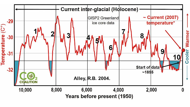
CO2 Coalition 's " Fact #13 " and  " Fact #16 " are essentially identical. Fact 13 claims that temperatures changed dramatically before human activity, and Fact 16 claims current warming isn't unprecedented. Both use the same graph. Fact 16 claims to be the first of three parts, but these parts aren't given sequentially. The other two of the three parts are " Fact #17 " and " Fact #26 ." These two "facts" are (like many others) lifted from Gregory Wrightstone's self-published book, which I've reviewed elsewhere. The text of this "Fact 16" is not identical to the book, but the content is basically the same, and some of it directly quotes the book. We're told that the current warming period is "very similar to nine other warming trends of the last 10,000 years. For more than 6,100 years (or 60%) of the current interglacial warm period, the temperature was warmer than it is today. Of the nine earlier...

Ole Humlum on CO2 Lagging Temperature

Image
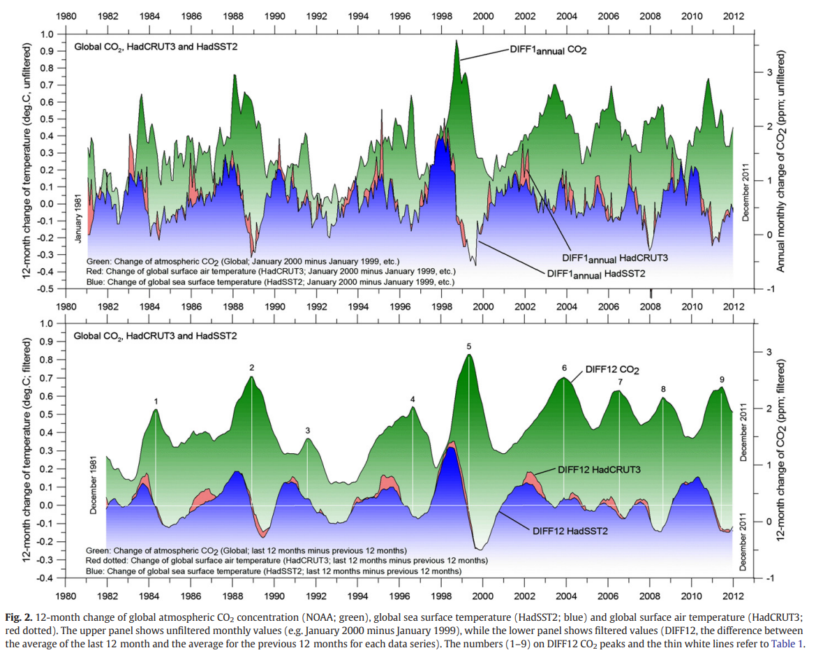
Ole Humlum published a paper about 10 years ago attempting to show that CO2 always lags temperature and therefore the increase in CO2 substantially comes from an increase in temperature, not the other way around. In the words of Humlum's paper, As cause always must precede effect, this observation demonstrates that modern changes in temperatures are generally not induced by changes in atmospheric CO2. Indeed, the sequence of events is seen to be the opposite: temperature changes are taking place before the corresponding CO2 changes occur. and  CO2 released from anthropogene [sic] sources apparently has little influence on the observed changes in atmospheric CO2, and changes in atmospheric CO2 are not tracking changes in human emissions.  What I want to show two things here. First, Humlum's argument is fatally flawed logically, and he has to hide that flaw with by detrending the data. Second, even if we were take his claims, it leads to absurd conclusions. Humlum's Fatal Log...

Is Temperature Causing the Increase in CO2?

Image
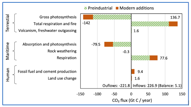
Every once in a while a paper gets published in a low-to-no impact journal suggesting that the increase in CO2 concentrations was caused by the increase in global temperatures and not by human emissions. There are several blogs and unpublished manuscripts that make similar claims. Now for sure, since CO2 is less soluble in warmer water, increasing sea surface temperatures, so increasing temperature does cause an ocean-to-atmosphere CO2 flux. But can this explain why CO2 levels are increasing? Some say yes. The most recent paper [1] was published in a no-name MDPI journal called Sci, and Judith Curry promoted it on her blog .  Papers and arguments like this are obviously nonsense, but this paper is a little unique in that it includes the very evidence that proves its central thesis wrong. The following chart comes from the paper. It takes data from the IPCC AR6 accounting of the carbon budget, showing the ocean, land and human sources and sinks. From the numbers the authors included...

Fake Paleoclimate Graphs

Image
If you spend much time on social media discussing climate science, you're likely to come across a graph that looks like the above. The argument associated with this will be that this graph shows that climate has been variable throughout the Holocene and modern warming is neither unprecedented nor unusual compared to other warming periods at other times during the Holocene. However, it would appear this graph is completely fake. There are multiple versions of this graph floating around the internet, and they conflict with each other, and some of them, like the one above claiming to be Greenland ice core data, are complete nonsense. Let's look at two common versions of this graph. Greenland Ice Core Versions Greenland ice core versions of this graph can be found promoted widely on the internet. The particular version above is unsourced, but based on what it presents, it can easily be seen to be faked. First, it claims to be ice core data from the Crete site in central Greenland, ...

Estimating TCR and ECS from the Logarithmic Relationship Between CO2 and GMST

Image
In a previous post , I calculated ECS (accounting for increases in GHGs and aerosols) to be about 3.3 C.  The calculation was based on CO2 causing 2.11 W/m^2 increase in radiative forcing with a total increase, after accounting for GHGs other than CO2 and aerosols, of 2.17 W/m^2 (aerosols cancel out most of the effects of GHGs outside of CO2). One weakness of that approach is that it used a value for EEI that was an average for 2011-2018 with forcings that were current through 2020. I've been thinking about a way to improve this, and here's what I came up with. Transient Climate Response (TCR) Since the relationship between CO2 and temperature is logarithmic, I decided to plot the relationship between temperature and ln(rCO2) to see what that might be able to tell us about sensitivity from empirical data. So in the above graph, on the y-axis I plotted GMST from HadCRUT5 using a 1850-1900 baseline to match the IPCC's approximation of preindustrial levels. On the x-axis, I pl...

How Do Cumulative Carbon Emissions Affect Warming?

Image
The IPCC (and others) have observed that there has been a near linear increase in GMST with cumulative anthropogenic carbon emissions. "In the literature, units of °C per 1000 PgC (petagrams of carbon) are used, and the AR6 reports the TCRE likely range as 1.0°C to 2.3°C per 1000 PgC in the underlying report, with a best estimate of 1.65°C."[1] To be clear, 1000 PgC = 1000 GtC = 1 TtC.  I decided to see if that has been observed in the empirical data. I took values from the 2021 global carbon budget [2] and HadCRUT5 set to a 1850-1900 baseline and plotted the relationship. The R^2 was 0.88, and the slope of the best fit line was 1.847 ± 0.104°C/TtC (2σ). So the 95% likely range is between 1.74 to 1.95 C/TtC from 1850-2021. If I start after we reach 200 GtC in 1951, the best fit line is 2.153 ± 0.176°C/TtC (2σ) and the R^2 increases to 0.90, but I think it's best to be conservative here. What this suggests to me is that the IPCC may again be a bit conservative their best e...