Were the 1930s "Dust Bowl" Heatwaves Worse than Today?
 |
| Heatwaves in the Continental US (1880-2020) |
The Dust Bowl
It's commonly believed that the heatwaves that hit the US in the 1930s were the worst in American History, at least since Europeans began colonizing the territory. And certainly they were terrible. The causes were due to a combination of natural phenomena as well as human activity. In particular, the Homestead Act of 1862 and the Enlarged Homestead Act of 1909 brought many families into the Great Plains believing that agriculture would allow them to make a life for themselves. Many of these were inexperienced farmers, so they brought with them poor farming practices. They over-plowed and replaced the deep rooted grasses of the Great Plains with wheat. When those crops began to fail with the onset of drought in 1931, they exposed bare soil, and the Dust Bowl began and lasted until normal rains returned in 1939.[1] To make matters worse, the radiative forcing from dust loading in the atmosphere increased drought intensity and caused the drought to spread northward.[2] The combined effect of natural events and human activity had devastating consequences for Americans.
These events had a massive effect on the heat waves in the 1930s, but they appear to be of a different character than the heatwaves that have been on the rise since the 1960s. These have been more characterized by extremely high nighttime temperatures, while the 1930s heat waves were characterized by extremely high daytime temperatures while night time lows were not as bad. The heat and drought depleted soil moisture, which reduced the moderating effects of evaporation.[3] The dry soils and lack of vegetation made it impossible for the land to cool itself through evaporation. So the land amplified the heat waves, making them worse than they otherwise would have been. In other words, while the 1930s would have had heat waves and terrible drought without human activity, human activity played a role in making the drought and the heatwaves much worse than they otherwise would have been.
These events had a massive effect on the heat waves in the 1930s, but they appear to be of a different character than the heatwaves that have been on the rise since the 1960s. These have been more characterized by extremely high nighttime temperatures, while the 1930s heat waves were characterized by extremely high daytime temperatures while night time lows were not as bad. The heat and drought depleted soil moisture, which reduced the moderating effects of evaporation.[3] The dry soils and lack of vegetation made it impossible for the land to cool itself through evaporation. So the land amplified the heat waves, making them worse than they otherwise would have been. In other words, while the 1930s would have had heat waves and terrible drought without human activity, human activity played a role in making the drought and the heatwaves much worse than they otherwise would have been.

But how do the US heatwaves of the 1930s compare to the heatwaves that have been increasing in recent decades? A few years ago, the EPA published a graph[4] that gives the strong impression that they were far worse than heatwaves of recent decades. But the definition of a "heatwave" used to make this graph seems to be a bit arbitrary. The definition of a heatwave used to construct this graph is "the number of heatwaves of 4-day duration with an average temperature exceeding the threshold for a 1 in 10 year recurrence." And that was limited to 876 long-term stations.[5] There are several aspects of this definition that seem rather arbitrary and perhaps cherry-picked. The graph is:
1. Limited to heatwaves of 4-day duration,
2. Limited to an average temperature exceeding a threshold for a 1 in 10 year recurrence,
3. Limited to only 876 long-term stations, and
4. Not based on gridded temperatures for the continental US, but only readings from these 876 stations.
So while it seems clear that heatwaves that match this definition of a heatwave were more common in the 1930s where those 876 stations were located, we cannot say how this compares to the entire U.S. or how the graph might change when constructed with a better definition of a heatwave. Can we do better? Turns out we can.
Dessler on Heatwave Frequency
On Twitter I recently found a series of tweets responding to Bjorn Lomborg's use of the above graph. To my knowledge these responses are pretty definitive, but I have only seen them on Twitter. It's also difficult to follow his train of thought, since they are constructed over multiple tweets (he made one tweet per graph and sometimes clarified what he had written in previous tweets). I thought it would be valuable to reconstruct his argument here with reference to his graphs and his words.[6] Please see the link to his tweets to check up on me. What follows is entirely his argument and the graphs are entirely his, not mine. I'm simply reproducing it wholesale and adding context so the argument flows well and more easily found by those who don't use Twitter.After noting the source of the EPA data[4][5], Dessler acknowledges that "There's nothing intrinsically wrong with this definition, but it sure seems arbitrary. Why 4 days? Why 1-in-10 events? When doing science, you should always be worried that arbitrary decisions (e.g., thresholds in an index) will give you arbitrary results." This is an extremely good point. Is the large spike in the 1930s "heatwave index" a product of how the index was defined or of a real change in trends following the 1930s? So he asks an important question. "If you change your definition of 'heat wave.' would you get a different answer?" He goes on to "find out."
He starts with the obvious. "The most obvious thing to do is to just count the number of hot days." He used "Berkeley Earth's gridded daily maximum temperatures" for what amounts to approximately the continental US. "For each grid cell, [we] find the 95th-percentile temperature from the entire time series (1880-2020) and then count the number of days each year that exceed that... Then, for each year, we count the number of exceedances in all grid cells in the domain. This is what the time series looks like for the U.S. Yes, the 1930s were hot, but hot days occur more frequently in the 2010s." See below.

He then points out that there appears to be two types of cherry-picking going on here. "First is the choice of an obscure (and frankly weird) metric. This metric almost certainly gives an answer that is opposite to what a more exhaustive set of metrics would show... The other cherry pick is only looking at the U.S. Let's look at the plot for the entire northern hemisphere mid-latitudes (29N-60N). The occurrence of hot days explodes after about 1980." See below.


Clearly the EPA metric is strongly affected by a small geographic area that is not representative of the global land surface. Using better metrics, recent decades in the US and the NH are shown to be much hotter with more frequent heatwaves. And as expected the 1930s heatwaves are far more prominent in the US than they were elsewhere in the NH because of the Dust Bowl conditions there. This isn't to say that the EPA graph is completely wrong or useless. Rather, it means that the metric used seems to be good at finding the kinds of heatwaves that were more common in the 1930s but not so good at finding the kinds of heatwaves that have become more common in recent decades. It points to the unique characteristics of the 1930s heatwaves, but not to the overall frequency of heatwaves in the US. And that's interesting, at least to me.
References:
[1] "Dust Bowl." https://www.history.com/topics/great-depression/dust-bowl
[2] Cook, B.I., R.L. Miller, and R. Seager, 2008: Dust and sea surface temperature forcing of the 1930s "Dust Bowl" drought. Geophys. Res. Lett., 35, L08710, doi:10.1029/2008GL033486.
http://ocp.ldeo.columbia.edu/res/div/ocp/pub/cook/Cook_etal_GRL_2008.pdf
[3] "Weather and Climate Extremes in a Changing Climate."
https://downloads.globalchange.gov/sap/sap3-3/sap3-3-final-all.pdf
[4] EPA. "Climate Change Indicators: Heat Waves". https://www.epa.gov/climate-indicators/climate-change-indicators-heat-waves
[5] Kunkel, K. E., Pielke, R. A., Jr., & Changnon, S. A. (1999). Temporal Fluctuations in Weather and Climate Extremes That Cause Economic and Human Health Impacts: A Review, Bulletin of the American Meteorological Society, 80(6), 1077-1098. Retrieved Feb 2, 2022, from https://journals.ametsoc.org/view/journals/bams/80/6/1520-0477_1999_080_1077_tfiwac_2_0_co_2.xml
[6] Dr. Andrew Dessler tweets. https://twitter.com/AndrewDessler/status/1429175004986499078
[7] Perkins-Kirkpatrick, S.E., Lewis, S.C. Increasing trends in regional heatwaves. Nat Commun 11, 3357 (2020). https://doi.org/10.1038/s41467-020-16970-7
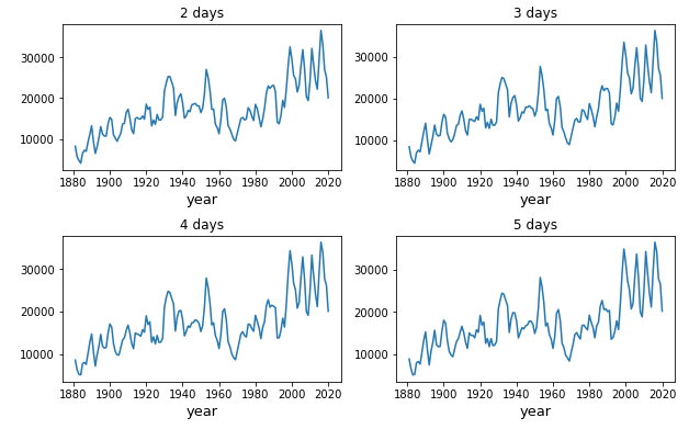
These results are consistent with the peer-reviewed evidence for the occurrence of heatwaves globally and regionally.[7] He concludes, "This is classic cherry picking: the plot cherry picks an unusual metric and also cherry picks a particular region. Examining the full data set shows the opposite of what's claimed. Temperatures and heatwaves are certainly worse today than in the 20th century." Dr. Dessler then followed up on a response from Bjorn Lomborg, who asked Dessler to consider evidence beyond just the raw number of hot days, since the EPA graph was for heatwaves of 4-day long duration. Dr. Dessler responded with two graphs showing heatwaves lasting between 2 and 5 days. The first showed "where the temperature of a heat wave is the minimum daily temperature." See below.
The second graph showed heatwaves where "the temperature of a heat wave is the average temperature." See below.
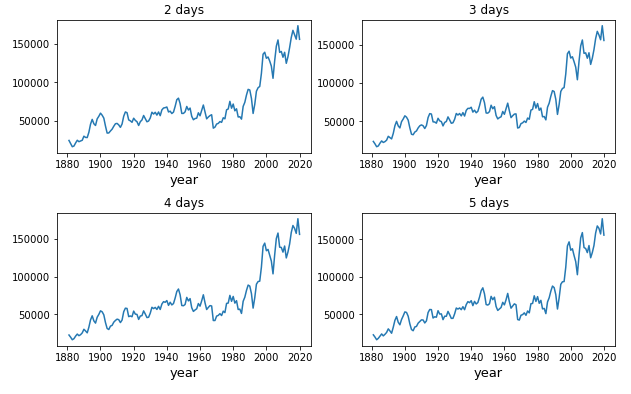
Dessler then expanded this to include multi-day heatwaves for the entire Northern Hemisphere mid latitudes. "This plot uses the minimum Tmax during a time span as the temp of the heat wave. Plotted here is the occurrence of heat waves > 95th percentile." See below.
And again, "This plot uses the average temperature of the time span as the temp of the heat wave. Again, plotting time series of occurrence of heat waves > 95th percentile. Y axis is grid cells times days." See below.
What seems clear at this point is that the EPA graph that Lomborg and other contrarians like to use is not the definitive standard for heatwave occurrence in the US. It's the product of an "obscure" and "weird" metric that is strongly affected by stations in the American Midwest. However, Andrew Dessler mapped Summer Tmax for the last decade relative to the 1930s, this is what the map looks like.
Clearly the EPA metric is strongly affected by a small geographic area that is not representative of the global land surface. Using better metrics, recent decades in the US and the NH are shown to be much hotter with more frequent heatwaves. And as expected the 1930s heatwaves are far more prominent in the US than they were elsewhere in the NH because of the Dust Bowl conditions there. This isn't to say that the EPA graph is completely wrong or useless. Rather, it means that the metric used seems to be good at finding the kinds of heatwaves that were more common in the 1930s but not so good at finding the kinds of heatwaves that have become more common in recent decades. It points to the unique characteristics of the 1930s heatwaves, but not to the overall frequency of heatwaves in the US. And that's interesting, at least to me.
References:
[1] "Dust Bowl." https://www.history.com/topics/great-depression/dust-bowl
[2] Cook, B.I., R.L. Miller, and R. Seager, 2008: Dust and sea surface temperature forcing of the 1930s "Dust Bowl" drought. Geophys. Res. Lett., 35, L08710, doi:10.1029/2008GL033486.
http://ocp.ldeo.columbia.edu/res/div/ocp/pub/cook/Cook_etal_GRL_2008.pdf
[3] "Weather and Climate Extremes in a Changing Climate."
https://downloads.globalchange.gov/sap/sap3-3/sap3-3-final-all.pdf
[4] EPA. "Climate Change Indicators: Heat Waves". https://www.epa.gov/climate-indicators/climate-change-indicators-heat-waves
[5] Kunkel, K. E., Pielke, R. A., Jr., & Changnon, S. A. (1999). Temporal Fluctuations in Weather and Climate Extremes That Cause Economic and Human Health Impacts: A Review, Bulletin of the American Meteorological Society, 80(6), 1077-1098. Retrieved Feb 2, 2022, from https://journals.ametsoc.org/view/journals/bams/80/6/1520-0477_1999_080_1077_tfiwac_2_0_co_2.xml
[6] Dr. Andrew Dessler tweets. https://twitter.com/AndrewDessler/status/1429175004986499078
[7] Perkins-Kirkpatrick, S.E., Lewis, S.C. Increasing trends in regional heatwaves. Nat Commun 11, 3357 (2020). https://doi.org/10.1038/s41467-020-16970-7


Comments
Post a Comment