Sniff Test for USFS Annual Report Fire Data (1926-1959)
The NIFC website contains a good deal of historical information about wildfires in the US. Up through 2018, one page contained historical wildfire data from 1960 to the current year. However, between 2018 and 2021, the NIFC added data from 1926 to 1959 coming from USFS annual reports. These data were not wildfire data comparable to data following 1983, and the NIFC included a warning not to compare the two sets of data. However, contrarians did so anyway and the data from 1926 to 1982 was eventually removed from the site, prompting conspiracy theories that the NIFC was hiding data. I detailed this in another post, and I'd highly recommend reading that post first to get a better sense of what I want to show here. In that post I researched what the USFS says about this data from 1926-1959 - what is known and what is unknown - from several reports written by Karen Short. Short made several points by delineating how much of the reported fire data was on unprotected vs protected lands and how much came from the southeast, and in particular Florida, Georgia, and Mississippi. Long story short, the reported fire data from 1926-1959 was not specifically "wildfire" data. It was dominated by what we today would call controlled/prescribed or intentional burns in the American southeast. These types of burns are not counted as wildfires in US wildfire statistics following 1983, so these two sets of data are not comparable to each other. Those who insist on doing so are not being honest about the data.
Analysis of USFS 1926-1959 Data
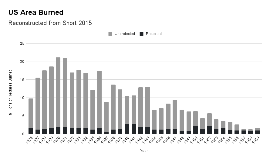
But what I want to show here is that this data is not even particularly believable. The sheer amount of area that was reported to have burned in FL, GA, and MS is mind boggling, and it suggests (as has been indicated by others and in my previous post) that fires were double or even triple counted. There was no standard reporting methodology within the USFS during this time, so these numbers are likely inflated. To illustrate this, I attempted to reconstruct the data that Short presented in the graphs I shared in my previous post. Admittedly these are just eyeballed from the graph she shared, since the actual numerical data is not available. But below you can see how I reconstructed the USFS data from 1926-1959. You can compare this graph to the graph in my previous post to see that what I did is close enough that my conclusions must be consistent with the data she presented.
Next I took the geographic data she presented from unprotected lands (the gray area above) and reproduced that by the same methodology. You can see this data and compare it to what Short had shared. The difference here between my graph and what Short's graph is I included area burned on both protected and unprotected lands in the graph below. The graph's total shape is the same as the one above, with the area on unprotected lands broken up geographically in three categories: FL-GA-MS, the rest of the southeast, and the rest of the US outside of the southeast.Comparison to Post 1983 Data
It should be clear here that US area burned by wildfires over the time frame where we have reliable data is dominated by wildfires in the west. Only a small fraction of the area burned comes from the east. So why is it that the unreliable 1926-1959 USFS shows a very different picture? Quite simply, because it's affected by spurious data coming at least from the southeast; it includes fires that aren't wildfires and likely counts area burned multiple times. The early 34 years of data doesn't pass any rational "sniff test" for wildfires in the United States.

.png)

.png)

Thanks for this cogent analysis - very nice.
ReplyDelete