Clintel Attempts an Analysis of AR6
Just recently an organization called Clintel (a combination of Climate and Intelligence) published a document called The Frozen Climate Views of the IPCC: An Analysis of AR6. Virtually none of this document has any substantial analysis of AR6. It basically regurgitates talking points that have been debunked for decades. The authors apparently compiled them into a single document with superficial references to AR6. I'd like to highlight what I consider the one of the most humorously dishonest parts of the document. I have a page with an outline of Clintel's document and links to rebuttals of their arguments here.
Clintel's Critique of the Instrumental Record
In a chapter entitled "No confidence that the present is warmer than the Middle Holocene," Clintel wants to make the claim that we don't have enough certainty regarding the proxy evidence and the instrumental record to know if current temperatures are warm with respect to the Holocene. In an attempt to show that uncertainties regarding global temperatures are large, Javier Vinós says,
This immaturity underscores a more worrisome problem. Figure 5 is an overlay of two GISS global temperature graphs, one from 2001 and the other from 2015. With the adjustments, the year 2000 became 0.4°C warmer with respect to 1880 than previously. Ole Humlum has been tracking these changes to GISS since 2008 (Climate4you 2021). At the very least these changes demonstrate that the confidence intervals of modern instrumental measurements mean very little and are only valid until the next major adjustment, therefore we do not really know how much the world has warmed since pre-industrial times with sufficient certainty.
No joke, the graph they use to support this point is below.
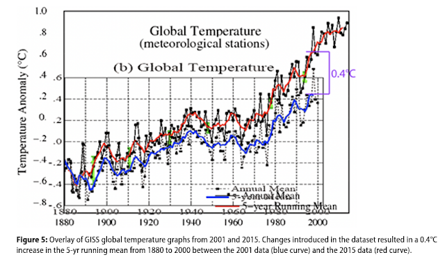
A perceptive observer will note that Humlum's graph just took two graphs and slapped one on top of the other, Tony Heller style. Humlum lined up the x-axis pretty well but displaced the y-axis by ~0.2 C. The idea here was to line up the two time series at 1880 and show the divergence between the the 2001 and 2015 versions of the graph. They diverge by ~0.4 C by about 1995, which Vinós incorrectly says is the year 2000.
You could be forgiven for thinking the above graph lacks professional competence. You might also wonder why they didn't just download the data for the 2001 and 2015 versions of NASA's graph and do a competent, professional graph. Or, if they really just wanted to copy someone else's graph, they could have used this graph of basically the same thing from NASA's website.

This graph shows the divergence between the 2001 version of NASA's data and the 2017 version of NASA's data, and the 2017 version does show more warming. I'd say ~0.4 C is a good estimate of the difference between the two. However, there are several things that Vinós doesn't explain to you:
- This graph shows MET stations only; it does not represent global temperatures. Global temperatures do not show differences this large.
- There is a more recent update to NASA's dataset after 2015 and 2017. GHCN v4 was updated in 2019, and the differences between the 2019 dataset and the 2001 dataset is smaller.
- Only a portion of the differences between the 2001 and more recent versions of their dataset are due to adjustments (bias correction). A large fraction of the difference is due to the addition of more stations to the network giving the dataset more global coverage. There were 7,200 stations in the network in 2001 and 26,000 stations with better Antarctic coverage in 2019.

With all this in mind, it should be easy to see the flaws in Vinós' claim that "these changes demonstrate that the confidence intervals of modern instrumental measurements mean very little and are only valid until the next major adjustment." What it actually means is that NASA has been working hard to improve the accuracy and global coverage of their dataset, and the updates to NASA's dataset reflect an improvement in accuracy. It's fundamentally dishonest to claim that because a dataset with improved accuracy disagrees with an earlier version of the dataset with less accuracy, we can't have confidence in the improved dataset. NASA has actually quantified the uncertainty of their most recent dataset.
In Lenssen et al (2019), we have updated previous uncertainty estimates using currently available spatial distributions of source data and state-of-the-art reanalyses, and incorporate independently derived estimates for ocean data processing, station homogenization and other structural biases. The resulting 95% uncertainties are near 0.05°C in the global annual mean for the last 50 years, and increase going back further in time reaching 0.15°C in 1880.[1]

As you can clearly see, most of the 2001 dataset differs from the 2019 version by ~0.1 C or less. In other words, the improvement in accuracy with GHCN v4 does show small changes with the 2001 version, but not nearly to the extent that Vinós claims. In fact, he appears to have overestimated the differences by about 4x, entirely by using MET stations only and not using the most recent version of the dataset. And he also fails to grasp that these differences reflect an improvement in accuracy due to better global coverage and improved bias correction. This is not at all an argument that uncertainties in the instrumental record are too large to be reliably compared to proxy temperatures in the Holocene. In the NOAA, BEST and HadCRUT5 datasets, current temperatures are about 1.2 C warmer than the 1850-1900 mean, and even though NASA's dataset only goes back to 1880, its warming is consistent with the other GMST datasets.
Conclusion
References:
[1] Lenssen, N., G. Schmidt, J. Hansen, M. Menne, A. Persin, R. Ruedy, and D. Zyss, 2019: Improvements in the uncertainty model in the Goddard Institute for Space Studies Surface Temperature (GISTEMP) analysis, J. Geophys. Res. Atmos., in press, doi:10.1029/2018JD029522.


Comments
Post a Comment