Will CO2 Concentrations Stabilize without Drastic Emission Reductions?
A paper was published recently in an MDPI journal Atmosphere[1] by Joachim Dengler and John Reid (DR) that aims to show that we can keep global temperatures from eclipsing the 1.5 C target "if we keep living our lives with the current CO2 emissions – and a 3%/decade efficiency improvement."[2] I saw this paper highlighted on Judith Curry's blog, so I figured it deserved some attention. The basic argument is that the amount of absorbed CO2 increases with CO2 concentration, such that at 475 ppm CO2 we will achieve net zero emissions - natural sinks will absorb 100% of our emissions and CO2 concentrations will stabilize if we improve our efficiency at 3% per decade. And if this occurs, GMST will stabilize at 1.4 C above preindustrial levels, keeping us below the 1.5 C thresholds from the Paris Agreement and IPCC targets.
This is a really odd paper. DR begin by acknowledging that a big portion of understanding how our carbon emissions affects climate depends on what percentage of our emissions remains in the atmosphere and what percentage gets absorbed by land and oceans. But the framing of this is really odd. They say climate scientists normally concern themselves with "How much CO2 remains in the atmosphere?" - we'll label this the airborne fraction of our carbon emissions (Fr). He observes that, "given the anthropogenic emissions and the limited capability of oceans and biosphere to absorb the surplus CO2 concentration, this has led to conclusions of the kind that a certain increasing part of anthropogenic emissions will remain in the atmosphere forever." Technically, none of our emissions stay in the atmosphere "forever," only for a very long time - hundreds to thousands of years. But the authors want to refocus the discussion around what they admit is the "logically equivalent" question, "How much CO22 does not remain in the atmosphere?" - we'll label this the absorbed fraction of our carbon emissions (Fa). DR then claim that even though the questions are logically equivalent (literally Fr = 1 - Fa), they are also very different. They say, "The amount of CO2 that does not remain in the atmosphere can be calculated from direct measurements. We do not have to discuss each absorption mechanism from the atmosphere into oceans or plants. From the known global concentration changes and the known global emissions, we have a good estimate of the sum of actual yearly absorptions." This is baffling. If it's true that the two questions are "logically equivalent," why are they "so different?" Any form of analysis that allows us to quantify Fr also necessarily allows us to quantify Fa and vice versa.
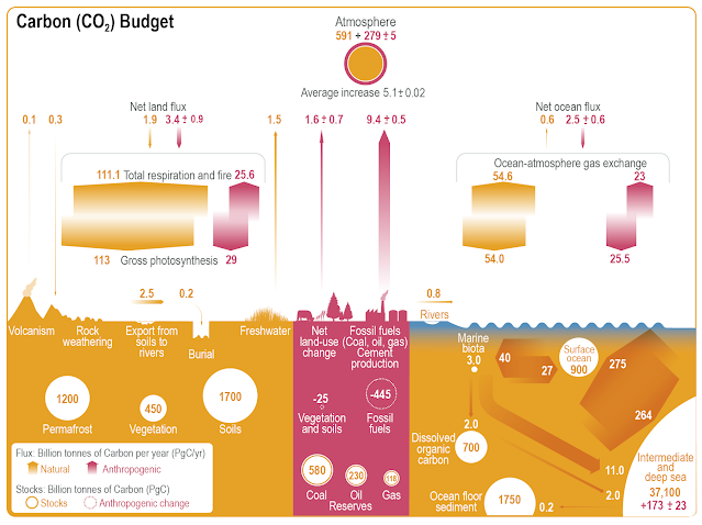
We can think of the issues here as a sink with a faucet and a drain. As long as the faucet pours water into the sink more rapidly than the drain can remove it, the water level in the sink will rise. If the pouring rate and drain rates are equal, the water levels stay the same, and if the drain rate exceeds the pouring rate, the water levels decrease. Essentially the same is true with CO2. There are natural and human "faucets" (or sources) for CO2 and natural "drains" (or sinks) for CO2, namely land and oceans. If human and natural sources contribute CO2 at faster rates than the land and oceans absorb them, then the CO2 concentrations increase. When sources and sinks are equal, CO2 concentrations are stable.
 |
| IPCC's Assessment of Carbon Sources an Sinks |
The IPCC has quantified human and natural fluxes from the various land and ocean sources and sinks. Human emissions from fossil fuels and land use change total about 11 GtC annually, but ocean and land sinks absorb 5.9 GtC of our emissions annually, so 5.1 GtC remains in the atmosphere. That means the IPCC estimates that Fr = 5.1/11 = 46% of emissions from 2010–2019. Long term however, Fr has been increasing. Using data from the 2021 Carbon Budget, I took annual human emission data from the Carbon budget for 1960 to 2021 and converted the values from GtC to GtCO2 and then from GtCO2 to ppm. I set the model to increase Fr linearly from 40% in 1960 to 50% in 2022. Here are the results.
%20(1).png) |
| The Airborne Fraction of Our Carbon Emissions is Increasing |
The IPCC also estimates that from 1850-2019 the airborne fraction has been about 41%. This means that long term Fr has been increasing. It's not hard to understand why. We have been increasing our carbon emission rates, and sinks have not been able to keep up with our emissions, so the airborne fraction of our emissions is increasing. The IPCC expects this trend to continue, with higher concentration pathways experiencing a larger airborne fraction than lower pathways.
 |
| Fr Increases with Higher Emission Rates |
Linear Dependence of Absorption on CO2 Concentrations
The fundamental claim of this paper is that "we do not need to know the actual coefficients of the individual absorption mechanisms—it is sufficient to assume their linear dependence on the current CO2 concentration." In other words, rather than looking at CO2 absorption as a fraction of our emissions, we should look at it as a fraction of CO2 concentrations. They propose that natural sinks will absorb a proportionate fraction of CO2 concentrations. This means that as CO2 levels increase natural carbon sinks also increase, and eventually, natural sinks will absorb 100% of our emissions, CO2 concentrations will stabilize and we will achieve net zero emissions. The paper estimates that should we continue with "the current CO2 emissions" and a "3%/decade efficiency improvement" we'll achieve net zero emissions at about 475 ppm.
 |
| DR Assume The Best Fit to this Data is a Straight Line |
The argument for this is basically a curve fitting exercise. Above the authors plotted CO2 concentrations with what they call the "relative CO2 absorption" using data from the 2021 Carbon Budget. The problems with this graph are numerous:
- The units of the y-axis should be ppm, not percent. It's the slope of the graph that would have units of ppm/ppm and thus could be described as a percent.
- The paper calculated a term Ni, which they defined as "the global natural net emissions during year i." However, after examining their calculations and comparing them to the 2021 carbon budget, what they called Ni was actually the budget imbalance - that is, the difference between the estimated sources and sinks. What they're calling "relative CO2 absorption" is actually total sinks minus the budget imbalance.
- The 2021 carbon budget contains annual values. During the early years, CO2 spent multiple years at the same CO2 ppm. During the more recent years, CO2 increased by multiple ppm every year. This paper just plotted annual values with atmospheric CO2 on the x-axis. You can see that they did this by the clumping of data close together at low ppm while at higher ppm, the datapoints are farther apart. This introduces bias into the slope of the graph, making the earlier values too low and the later values too high. The authors should have added values from multiple years at the same ppm and adjusted the later values for the fact that they count for multiple CO2 concentrations.
- The authors performed smoothing on their data before plotting the above graph, inflating their r^2 value.
- They assumed a linear relationship between these two variables, even though a polynomial fit had a higher r^2 value.
I wanted to see just how wrong this graph is. In order to (mostly) account for this bias, I binned the sink values in 10 ppm increments, then summed up the values for sinks within these increments. In later years, if CO2 ppm went from, say 388 to 401 ppm between years, some portion of the annual value at 401 ppm would belong in the previous bin, but I think the effect would be minimal - certainly a huge improvement over what the paper tried to do. I then plotted the values of the land sink, ocean sink, total sinks and the airborne fraction for each 10 ppm bin from 280 ppm to 410 ppm. I then plotted the linear trend for each of these bins and the airborne fraction. Turns out sinks are actually decreasing in size as CO2 increases, and the airborne fraction is also increasing. This is in line with the IPCC and falsifies the MDPI paper.
 |
| Graph Updated Jan 2025 |
So the analysis in this paper is completely wrong. Total sinks are actually decreasing at a rate of ~0.6 GtCO2/ppm. The values on the y-axis of DR's graph are basically arbitrary and the units are wrong. They introduced bias into the data that artificially increases their calculated slope, and the best fit isn't linear. In fact, the ocean sink is not linear - the oceans become less efficient at absorbing CO2 as CO2 increases. I'm planning to do a separate post on this in the near future. But on the basis the assumption of a linear relationship between atmospheric ppm and an arbitrary metric and a biased slope, they produced a simple model. They tested this model by fitting 1950-1999 data and projecting from 1999. The curve accurately predicted 2000-2020.
 |
| DR's Model from 1950-1999 Predicts 2000-2020 |
But is this surprising? The assumption of a linear relationship may well "work" short term, even if the actual relationship isn't linear. This can be seen quite well in the relationship between CO2 and temperature. It has been well understood for over 100 years that this relationship is logarithmic - doubling CO2 produces a linear increase in temperature. But if you plot CO2 and GMST from 1850 to present and assume a linear relationship, you'll get a pretty good fit (with an r^2 of 0.886), and that fit will produce good predictions short term, even though the relationship is known to be wrong.
.png) |
| Bad Assumptions Can Produce Good Results Short-Term |
- DR's assumption requires that the airborne fraction (Fr) of our emissions must decrease from 46% to 0% between 420 ppm and 475 ppm. But the long-term empirical data so far shows exactly the opposite trend. Fr has been increasing. For his hypothesis to work, his modeled trends must immediately reverse empirical trends through 2021.
- There is good evidence that the oceans do not behave as DR assume in this paper. We do not have good evidence that natural sinks are keeping up with current emissions, much less capable of increasing as CO2 concentrations rise.
- We know from paleoclimate studies that CO2 levels have been much higher than they are now. During the warmer periods of the earth's history CO2 has been upwards of 1000 ppm. But there is no evidence that natural sources can add CO2 to the atmosphere at rates we're currently experiencing. The major source of atmospheric CO2 is volcanic activity. The most rapid carbon emissions detected within the Phanerozoic occurred during the PETM. One study estimated that during the PETM about 10,000 GtC was released over 50,000 years, which is an average of about 0.2 GtC/year. Current anthropogenic emission rates exceed 10 GtC/year. So our emission rates are ~50 times more rapid.[3] However, CO2 concentrations likely exceeded 2500 ppm.[4] The assumptions of this paper would mean that these observations couldn't have happened, even granting the lower resolution CO2 proxy data for the PETM. Emission rates would have to well exceed what we are producing now in order to add CO2 more rapidly than natural sinks can remove it at such high concentrations of CO2.
The last point here to me is a nail in the coffin of this hypothesis. Paleoclimate evidence shows us that CO2 concentrations have been much higher than today without the rapid carbon incursions they claim are required to achieve high CO2 levels. At the very least, I think we can confidently say here that the authors have not made a competent case that the relationship they describe is linear or even that they describe the relationship they believe they have described.
Expected Warming at 475 ppm CO2
For the sake of argument, though, let's assume the emission scenario he proposes - that is an emission scenario in which CO2 levels stabilize in ~2070 at 475 ppm. This paper calculates that this scenario would produce 1.4 C warming above preindustrial levels by 2100. But would such a scenario actually allow us to stay below the +1.5 C target?
DR's argument that it would is based on the correlation between sea surface temperatures and CO2 concentrations. In their paper, on what they admit is an oversimplified assumption that CO2 alone explains all warming. they claim they plotted CO2 and the HadSST2 dataset. From the correlation between the two, they produced another equation, dT = −16.0 + 2.77*ln(rCO2). Using this equation, they then projected warming at 475 ppm to be 1.4 C above preindustrial levels. In the blogpost, they also said this produces a "sensitivity" of 1.92 C.
 |
| Relationship Between CO2 and HadSST2 |
This is horribly wrong. The authors chose to base their projections on a SST dataset, rather than a GMST dataset. Since land is warming more rapidly than SSTs, this will necessarily under-predict warming. Since Dengler was responding to comments on Curry's blog, I asked him about this. He said he chose to use the SST dataset to "streamline the paper," since he used the SST dataset earlier in the paper. But he assured me that he can "confirm that the CO2 sensitivity based on HadCRUT4 data is approximately the same as on HadSST2." He also assured me I can check it myself. I also asked him why he chose to us HadSST2, which ends in 2013, when the current HadSST4 was available. His response was "I trust slightly older data sets more, because I have evidence, that around 2011 there have been substantial temperature manipulations." And yet when pressed he acknowledged he had actually used HadSST4, since he couldn't have performed his 2002-2020 analysis without it. Given the graph above, I believe that, though his paper (including the link in the footnote) all point to HadSST2.
So of course I checked up on what he did. I downloaded HadSST4, HadCRUT4, HadCRUT5 and BEST and plotted all four with CO2 forcings on the x-axis (calculated as 5.35*ln(C/280). This is a plot of the linear relationship between CO2 forcings and temperatures. The slope of this line would be the calculated TCR in the GMST datasets. I then calculated the effective TCR for each and expected warming at 475 ppm. The slopes for each plot were:
- HadSST4 0.501 C/W/m^2 ~TCR = 1.86 C Warming: 1.42 C
- HadCRUT4 0.536 C/W/m^2 TCR = 1.99 C Warming: 1.52 C
- HadCRUT5 0.625 C/W/m^2 TCR = 2.32 C Warming: 1.77 C
- BEST 0.668 C/W/m^2 TCR = 2.48 C Warming: 1.89 C
My analysis essentially replicated DR's results using HadSST4. However, all the GMST datasets produce warming above 1.5 C. The HadCRUT4 dataset is out of date and has known coverage bias issues that underestimate recent warming, so for the remaining analysis I'm going to limit myself to HadCRUT5, since that's the more conservative of the two current GMST datasets. In the graph below, the lines are in different places because of the baselines for each dataset. But the slopes are unaffected by the baselines, and the differing baselines makes it easier to see the trend lines.
.png)
dT = (3/3.71)*5.35*ln(475/280) = 2.3 C
In order to keep warming below 2 C by 2100, ECS would have to be lower than 2.6 C, but that's not a reasonable value given that we've calculated TCR to be 2.3 C in HadCRUT5 (as a general rule of thumb, ECS ≈ 1.5*TCR).
Conclusion
[1] Dengler, Joachim, and John Reid. 2023. "Emissions and CO2 Concentration—An Evidence Based Approach" Atmosphere 14, no. 3: 566. https://doi.org/10.3390/atmos14030566
[3] Marcus Gutjahr et al, "Very large release of mostly volcanic carbon during the Paleocene-Eocene Thermal Maximum" Nature. 548/7669 (August 30, 2017): 573–577
https://escholarship.org/uc/item/1n988123
[4] Gehler, A., Gingerich, P. D., & Pack, A. (2016). Temperature and atmospheric CO2concentration estimates through the PETM using triple oxygen isotope analysis of mammalian bioapatite. Proceedings of the National Academy of Sciences, 113(28), 7739–7744. doi:10.1073/pnas.1518116113. https://www.pnas.org/doi/10.1073/pnas.1518116113


Comments
Post a Comment