Emergence of Climate Impact Factors in IPCC Assessments
There is a table floating around X and other social media outlets being used to claim that even the IPCC acknowledges that most extreme weather events are not increasing in frequency or severity. This claim comes from a misreading of Table 12.12 in the AR6 report from the IPCC.
The line of reasoning comes almost entirely from this chart, and in the past, I've responded to several people making these claims by quoting from the text of AR6 to clarify what it says about some of these climate impact drivers (CIDs). But Tim Osborn put together a series of posts on X that does a better job of explaining how badly these people are misreading the chart. Following extended arguments on X is sometimes difficult, especially for those who (like me) don't pay to be able to make longer posts. So I thought it would be helpful to reproduce his argument here in a manner that is more easy to digest without the need to scroll through several posts and hope you're keeping them in order. I want to give full credit here to Tim Osborn, though. This is essentially his good work, not mine. I'm just putting it together in a way that will make it more easy to digest. If you're on X and think this well-reasoned, head over to X and follow him. I've benefitted from him significantly in recent months.
Essentially the main problem here is a misunderstanding of the what is being presented. A blank white cell does not mean that there is no trend in the CID. What it means is that, on a local level, the CIDs have not "increased by more than 1 standard deviation of their normal local variability" (unless otherwise indicated, all text in quotes in this blogpost is from Osborn's posts on X). This is what the IPCC means by "emergence." A CID has emerged above local natural variability if it has increased by more than 1σ above natural variability in that area.
Whether a CID has "emerged" is also dependent on scale. A particular CID may not have emerged on a local level, but if many locations in a region experience the same trend, that CID may well have emerged on that regional scale and achieved 1σ significance or higher. So the fact that a cell block in the table above is white does not mean that there is no trend, and it certainly does not mean that the CID hasn't emerged from natural variability on a regional or global scale.
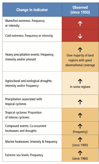
It would appear that people are choosing to promote and misrepresent Table 12.12 while at the same time ignoring the text of the report as well as other tables and figures that give a fuller picture of what the assessment report is saying about these CIDs. For instance, Osborn points to IPCC-AR6 Table TS.2, which shows clear indicators of trends for several CIDs.
And the Summary for Policy makers shows what the IPCC considers to be the human influence contributing to changes in weather and climate extremes. Osborn shares IPCC-AR6 Fig SPM.3:
And while it's fair to say that the IPCC doesn't claim that all types of extreme weather are becoming more frequent or more severe, we shouldn't minimize the impacts that the IPCC (and others) are actually observing. And as Table 12.12 indicates, sometimes cells remain white simply because data is too sparse to make conclusions with high confidence. But overall, the IPCC is clear that AGW is already affecting many extreme events in every region around the globe. Osborn cites the following.I get that some people believe that the media keeps telling us all extreme events are caused by AGW and attribution to AGW is taken to be automatic, and I think it's fair to caution people to wait for the attribution study before making claims about the impact of AGW. But it strikes me that this kind of reasoning is not just a caution to be more careful about assigning attribution. It's actually a misreading of the available evidence that appears to be motivated by an agenda to minimize the impact of AGW, and the evidence is overwhelming that AGW is already having some impacts on extreme events.


Comments
Post a Comment