Posts

Showing posts from June, 2022

Unskeptical Challenges to Hockey Stick Temperature Reconstructions

Image
Comparison of Loehle 2008, Pages 2K and HadCRUT5 In 2007, Loehle published a multiproxy study[1] estimating global temperature over the last 2000 years. It's distinctive feature was that it removed all tree ring proxies, leaving only 18 proxies to estimate global temperatures. According to the abstract the paper shows a warm MWP compared to today. "The mean series shows the Medieval Warm Period (MWP) and Little Ice Age (LIA) quite clearly, with the MWP being approximately 0.3°C warmer than 20th century values at these eighteen sites." Loehle 2007 Temperature Reconstruction Admittedly this reconstruction looks very different from the "hockey stick" reconstructions from Mann and other authors. However, Loehle's reconstruction contained several errors in the way the dates were handled, and once discovered, a revised version of this paper was published in 2008.[2] "Several errors in data handling in that report have come to light, leading to the need for th...

Misuse of the GISP2 Ice Core

Image
Central Greenland Temperature Reconstruction In 2000, R. B. Alley published the results of a proxy analysis of a single ice core in Central Greenland as part of the GISP2 project.[1] The resulting time series reconstructs local temperature fluctuations over the last 50,000 years. The graph above includes only the last 15,000 years; you may see versions of this graph showing the last 10,000 or 12,000 years. The proxy reconstructs temperatures at the Greenland Summit (the GISP2 project) using the ratio of two different oxygen isotopes: 18O and the more abundant 16O. Lower the 18O/16O ratio indicates lowers temperatures, since as temperatures decrease, a more 18O precipitates out at lower latitudes, making the 18O/16O ratio smaller over Greenland. Alley's time series ends 95 years BP, or 95 years before 1950, so the last data point in this analysis is 1855. The IPCC and other organizations are interested in modern warming frequently consider modern warming as measured against the 1850...

How Do We Know that Increasing CO2 Causes Warming?

Image
This is part 1 of a two part post. The evidence that increasing CO2 causes air temperature to warm began to accumulate as far back as the 1850s with studies from William Tyndal l[1][2] in the UK. Tyndall's experiment can be roughly replicated in high school lab classrooms with pretty simple experiments, some of which are demonstrated on YouTube. Estimates of climate sensitivity to increasing CO2 can be found in the works of Arrhenius[4] in the 1890s and Plass in the 1950s.[5] The landmark work of Manabe in 1967 successfully modeled the effects of increasing CO2 on the climate system. His study produced theoretical predictions that have been observed ever since. Especially since the satellite era, for instance, scientists have observed that the stratosphere is cooling while the troposphere is warming, just as Manabe expected. In the 1970s, scientists arrived at an estimate of equilibrium climate sensitivity[7] of about 3 C; an estimate that still continues to be at the center of sc...

Fake Paleoclimate Graphs

Image
If you spend much time on social media discussing climate science, you're likely to come across a graph that looks like the above. The argument associated with this will be that this graph shows that climate has been variable throughout the Holocene and modern warming is neither unprecedented nor unusual compared to other warming periods at other times during the Holocene. However, it would appear this graph is completely fake. There are multiple versions of this graph floating around the internet, and they conflict with each other, and some of them, like the one above claiming to be Greenland ice core data, are complete nonsense. Let's look at two common versions of this graph. Greenland Ice Core Versions Greenland ice core versions of this graph can be found promoted widely on the internet. The particular version above is unsourced, but based on what it presents, it can easily be seen to be faked. First, it claims to be ice core data from the Crete site in central Greenland, ...

Do Old Temperature Graphs Prove that Agencies are Lying?

Image
One of the enduring points of debate on social media has to do with claims that NASA and NOAA (and for that matter, pretty much the entirety of climate science) is fabricating the warming we've been experiencing since the 20th century. The "proof" of this sometimes comes from comparing old graphs of global temperatures with newer graphs. The difference between them is thought to be proof that NASA, NOAA (and the rest of climate science) is lying. Tony Heller is perhaps the most popular purveyor of this kind of conspiratorial thinking, and this week, he posted a couple videos where he recycles the same kind of stuff he's been saying for over a decade. His main conspiratorial argument in these comes from a graph from 1974. There are a couple versions of it that can be found online; one is from Newsweek from April 28, 1975. The source for this is said to be the National Center for Atmospheric Research. The description of this graph in the main body of the article says, ...

Does Marcott 2013 Show that Current Warming is Exceptional?

Image
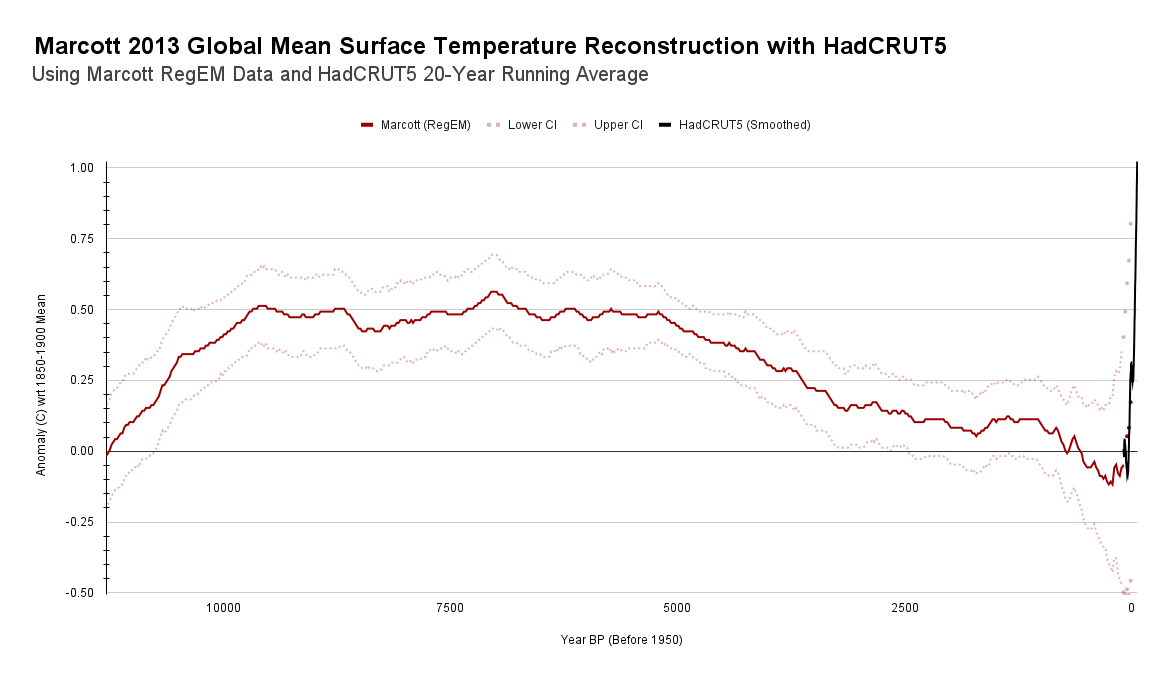
In a previous post , I considered whether the global temperature reconstruction continues to be valuable after 1) newer studies have been published with fewer seasonal biases and 2) criticisms that portions of the reconstruction are not robust. I concluded that the reconstruction continues to be valuable both because it remains a "conservative" look at temperature variability during the Holocene and because criticisms about the robustness of the reconstruction turn out to be entirely unfounded. What I'd like to do now is consider what the reconstruction tells us about natural climate variability during the Holocene and how this should cause us to evaluate current warming. A casual look at the Marcott 2013[1] with the instrumental record is certainly alarming. Marcott's Holocene reconstruction shows relatively slow warming up until about 7000 years ago, then slow cooling into the the Little Ice Age. There's a "bump" in the graph associated with the Mediev...