Posts

Showing posts from January, 2022

Graphing CO2 and Temperature for the Phanerozoic

Image
My last post  was a bit of a rant. I apologize for that (sort of), though I get bombarded with these obviously erroneous graphs, and I wanted to put down in one place all the problems I have with that family of contrarian graphs. But it occurred to me today that it would be more helpful (and less of a rant) if I demonstrate how the data used in those graphs would look different if the problems I described were fixed. So to do this, I went on an internet search and found a wonderful set of data from a paper I described in an earlier post , Royer 2004. It's a spreadsheet with the data from the GEOCARB III model (which originates in Berner 2001) and global temperatures corrected from Vezier.[1] This only goes back 520 million years, but I found the full Berner CO2 data on another site.[2] The CO2 data is reported in RCO2, which is the ratio of CO2 at a time in the past and preindustrial CO2 (280 ppm). So I converted these values to a change in radiative forcing (RF) from preindustrial...

Contrarian CO2 and Temperature Graphs: Really?

Image
Example 1: CO2 and Temperature I frequently hear that climate scientists only consider the last 150 years of history (since the beginning of the instrumental record), and if we paid better attention to geology, we would realize one or more of several things: 1) CO2 doesn't correlate with temperature or doesn't affect global temperatures, 2) climate changes are normal, so there's no danger with current warming, 3) most of the earth's history has been warmer than today, so a bit of warming would be good or 4) CO2 levels have been declining to dangerous levels for millions of years, and thankfully we burned fossil fuels to save the planet from CO2 starvation. None of these claims are true, and none have any basis in geologic evidence. I have several posts here showing the correlation between CO2 and temperature and/or glaciation. So where do people get this idea? One of the chief sources of misinformation is crappy graphs like the one above (Example 1). Early Examples Exa...

Is the Tropospheric Hotspot a Problem for Climate Science?

Image
Since warm air holds more moisture, any rise in surface temperatures, regardless of the cause of that rise, will cause more evaporation and thus more water vapor in the atmosphere. This means that a rise in surface temperatures decreases the “lapse rate” - the rate of cooling as altitude increases. The lapse rate is slower at the equator than at the poles - the rate at the equator is about half that of the subtropics. Because of this, it’s been predicted that there should be a tropospheric “hot spot” in the tropics. Climate models predict this because there is good reason to expect it, and this is true regardless of what is causing the warming. It should be there whether warming is caused by an increase in TSI or an increase in GHGs. Finding that hotspot would not mean that we have detected an anthropogenic signature of warming due to GHGs; it rather would mean that we understand how surface warming affects lapse rates. Not finding the hotspot means either: 1) we have more to learn abo...

John Tyndall on the Greenhouse Effect, 1859

Image
John Tyndall John Tyndall is often credited with discovering the Greenhouse Effect. That's not quite true, since Eunice Foote's paper was published before Tyndall's. However, this quote from Tyndall's paper is remarkable. Not only did he understand that greenhouse gases trapped heat, he understood that it was the heat radiating from the planet that was trapped, not the solar energy entering the climate system. Here's an excerpt from John Tyndall's 1859 paper entitled, "On the Transmission of Heat of different qualities through Gases of different kinds." The bearing of this experiment upon the action of planetary atmospheres is obvious. The solar heat possesses, in a far higher degree than that of the lime light, the power of crossing an atmosphere; but, and when the heat is absorbed by the planet, it is so changed in quality that the rays emanating from the planet cannot get with the same freedom back into space. Thus the atmosphere admits of the entra...

2021 Global Mean Surface Temperatures

Image
I keep a spreadsheet of the major Global Mean Surface Temperature (GMST) datasets. The numbers for December 2021 and the year of 2021. So I plotted the data from NASA, NOAA, JMA, Berkeley Earth (BEST), and HadCRUT5. The year ended up basically in a statistical tie with 2018 as the 6th warmest year on record and both 2018 and 2021 are the warmest La Nina years on record. It's amazing to me how much agreement there is between these datasets. To illustrate, I calculated the average of all of the above and plotted the average with the 95% confidence intervals from the HadCRUT5 dataset. The average seems to consistently fall within the 95% confidence interval for HadCRUT5. I also decided to do a little calculation to update the when we can expect to hit 1.5 C if we continue at the same pace. To estimate this I used basically the same method used in the IPCC 1.5 C report. I took the HadCRUT5 dataset and calculated 30 year trends (centered) through 2005. Then I took the 30 year trend (0.2...

Human Activity Has Likely Caused Virtually All the Warming since the Late 19th Century

Image
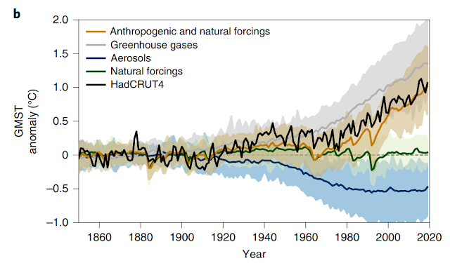
The IPCC AR5 estimates that human activity is responsible for ~110% of the warming since 1951. This statement may seem far fetched to some, but a new paper from Gillett suggests that this actually may be a bit conservative. Gillett's work extends that analysis back to the latter half of the 19th century. The study concluded that "anthropogenic forcings caused 0.9 to 1.3 °C of warming in global mean near-surface air temperature in 2010–2019 relative to 1850–1900, compared with an observed warming of 1.1 °C. Greenhouse gases and aerosols contributed changes of 1.2 to 1.9 °C and −0.7 to −0.1 °C, respectively, and natural forcings contributed negligibly." In the above graph, you can see the that the impact of GHG and aerosol forcings dwarf the impact of other natural forcings. ' Observant readers may note that there are two relatively short-term temperature spikes in the instrumental record, one during the 1860s and another during the 1940s. But these warm years cooled ag...

A New Reconstruction of Arctic Sea Ice Extent Since 1850

Image
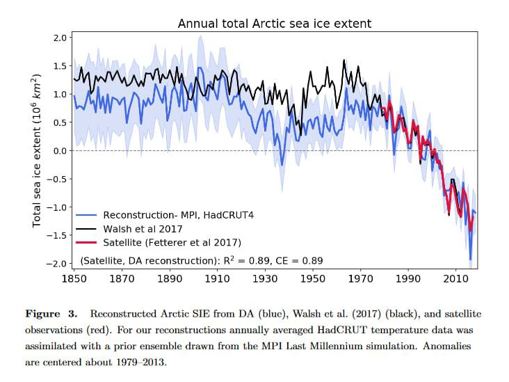
Over the last decade, there have been several attempts to reconstruct Arctic Sea Ice Extent. Kinnard et al 2011[1] reconstructed Arctic sea ice over the last 1450 years. Within that paper he also included a reconstruction beginning in 1870. Both of his reconstructions show natural variability of sea ice cover followed by a dramatic decline following ~1970. Walsh et al 2017[2] reconstructed sea ice extent beginning in 1850 with a monthly time resolution. His reconstruction also showed some natural variability followed by a dramatic decrease in sea ice extent following ~1970. But just last year, Brennan et al. 2020[3] examined Walsh’s study and found that likely underestimated sea ice variability, especially in the early 20th century, and sea ice extent is likely more sensitive to rising temperatures than is shown in Walsh’s study. Her analysis produced what is likely the best reconstruction of annual sea ice extent to date, and while it largely agrees with Walsh, it shows a greater decr...

The Greenland Ice Sheet in 2021

Image
Total Mass Balance Change For the 25th year in a row, the Greenland Ice Sheet (GrIS) lost ice. The total mass balance (TMB) is calculated by accounting for 1) the surface mass balance (SMB), where accumulation at the top of the ice sheet normally exceeds ablation and 2) ice discharge (D) which is the loss of ice through glacial calving and basal melting where glaciers are in contact with seawater. For the 25th year in a row, the loss of ice from discharge exceeded mass gains from the surface. There were several notable features and events from the GrIS in 2021: 1. The loss of mass from ice discharge was the largest amount since satellite observations began in 1986. 2. It rained at the top of the GrIS at a station 3216 m above sea level. 3. For the third time in a decade, scientists have observed a melt layer at the station (2021, 2019 and 2012). Melt layers have only been observed 6 times previously over the last 2000 years: 1889, 1094, 992, 758, 753 and 244. Resources: [1] "Polar...

Global Carbon Budget 2021

Image
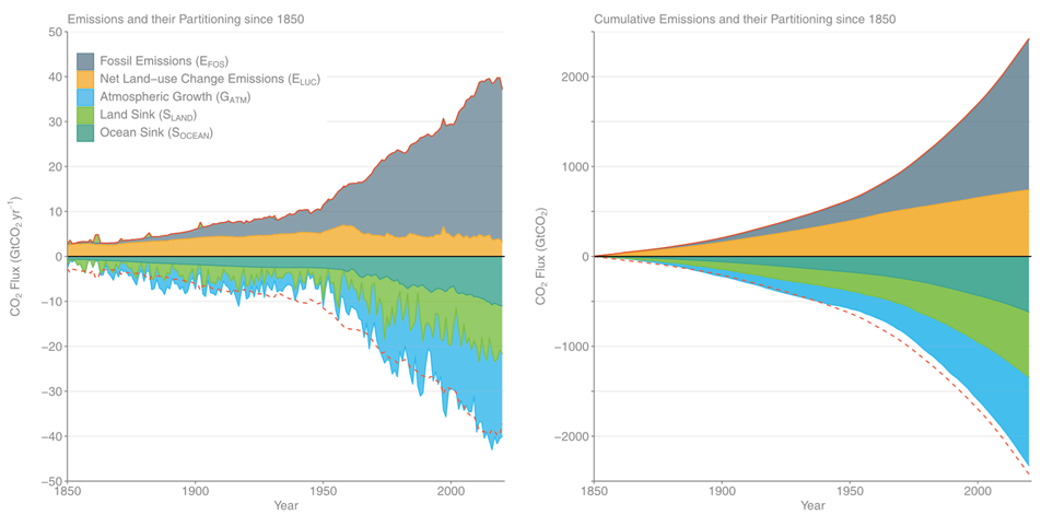
The "Balance Sheet" for the Global Carbon Budget The 2021 global carbon budget[1] is out and is undergoing peer review. The budget contains emission estimates for 2020 and preliminary estimates for 2021. I’m reporting these in GtC; to convert these figures to GtCO2, you can multiply these numbers by 3.67. In 2020, fossil fuel and industry emissions totaled 9.5 GtC and land use change totaled 0.88 GtC. In 2021, preliminary estimates are that fossil fuel and industry emissions totaled 9.92 GtC while land use change totaled 0.8 GtC. In terms of cumulative emissions, this means that from 1750, anthropogenic emissions have totaled 691 GtC through 2020 and about 702 GtC through 2021. Meanwhile, CO2 concentrations have increased from about 277.6 ppm in 1750 to 414.24 ppm in 2020 and 416.45 ppm in 2021.[2] That’s a 49% increase in CO2 concentrations. If we convert the 136.6 ppm increase from 1750 to 2020, that means that there is 291 GtC more carbon in the atmosphere now than there w...

How Should we Understand Confidence Intervals?

Image
This is Wrong Whenever you read the scientific literature, you'll frequently encounter estimates that include "confidence intervals." Generally speaking most of us understand these to give us an understanding of how sure scientists are that in their estimates they "got it right." And yet there is frequently confusion and even miscommunication about what confidence intervals mean that can sometimes unintentionally cause us to misrepresent (even if slightly) what scientists are actually claiming. It's something I've done in the past, and it's something that affects many well-intentioned people just trying to represent the data accurately. What I want to do in this post is to accurately describe what is being stated when confidence intervals (CIs) are reported, and then offer some reflections on the way this can impact our communication of the confidence we can have in scientific evidence. Confidence vs Probability At the heart of the confusion is a fai...

Are Satellites More Accurate than Surface Thermometers?

Image
Surface thermometers are old technology, and to be useful, they have to be extremely limited (more on this in a minute). Satellites, however, are the latest and greatest technology and are capable of measuring temperature (kind of) of different strata of the atmosphere. It can be tempting to think that we should trust satellite data over surface thermometers. But is that true? The tl;dr here is that surface thermometers are more accurate for Global Mean Surface Temperatures (GMST) while satellites make up for their lack of accuracy with some very helpful and useful information about how layers of the atmosphere are changing. In this post, I want to consider first how surface thermometers compare to satellites in general. In a second, follow up post , I will look more closely at individual satellite datasets and consider if one is more accurate than the others. The Instrumental Record Perhaps the biggest advantage of surface thermometers is that it's old technology. The instrumental...